Introduction
I previously wrote a post on the Liner Shipping Connectivity Index (LSCI), which is data that UNCTAD compiles for countries around the world. The idea is to use these data to compare different nations’ global shipping status.
For this post, I’d like to shift focus from shipping to port infrastructure, and from a global spotlight to a domestic one. To this end, I went to the MARAD website and retrieved United States vessel call datasets here for the available years. Unfortunately, the data is not completely up to date. The years range from 2002 to 2015 only. MARAD—if you are reading this, kindly upload the latest vessel calls data for the most recent years!
As a native Rhode Islander, I also chose to spotlight Rhode Island port activity, as well as the port activity of other New England states.
I have yet to include in-line code for a post on my blog, so I figured this post would be a good start. If you are not interested in the R code used to produce the plots and the analysis, you can skip over each code snippet and just read the text. As a reminder, I collect the code that I use to generate the content for ALL of my posts at a single repo here.
Before I head into the analysis, I first need to introduce a few terms to best understand maritime vessels and shipping. First I will cover vessel types, and then I will talk about a few key measures that are standard for the shipping industry.
Vessel Types
- Bulk Carriers
Also known as dry-bulk vessels, these ships range widely in size and transport unpackaged cargo such as ore, cement, woodchips and grains in their cargo holds.

- Tankers
These vessels are designed to transport liquids or gases. Most commonly these ships transport oil and other petroleum products, though they can also be used to ship products as diverse as methanol and vegetable oils.

- Containers
These vessels have a special role in the international economy. According to some sources, container vessels ship about 90% of all non-bulk cargo. They do so through the use of intermodal containers measured in twenty-foot equivalent units (TEUs). They are now the lifeblood of international trade, and rival oil tankers and bulk carriers as some of the largest vessels on the seas.

- General Cargo
These are vessels that transport goods but without the use of containers. These include barges, livestock carriers and refridgerated vessels (known as reefers). These ships transport general goods ranging from machinery to live animals to dairy products.

- RoRo
These Roll-on/Roll-off (or “RoRo”) ships transport wheeled cargo like automobiles, railroad cars and other wheeled machinery. Many employ specialized ramps that are built into the ship and make it efficient to drive the cargo off of the vessel.

- Gas or LNG/LPG
Finally, we have gas, liquified natural gas (LNG), and liquified petroleum gas (LPG) vessels. These are some of the most specialized ships becasuse they need to be designed to handle a very specific type of cargo. They are most often characterized by four tanks in which there are submerged pumps used for cargo discharge, as seen in the picture below.

Key Measures
Calls A vessel call is a recorded arrival of a vessel at a port or terminal. According to MARAD, this measure “may include berth shifts, movement to and from an anchorage while awaiting cargo, or may include other activities related to vessel, port or terminal operations.”
Capacity Capacity for a port is the number of vessels calls weighted by the sum of the capacity of all vessels that arrived at that port. There are different ways to measure a vessel’s capacity. In the full dataset, MARAD uses two measures for vessel capacity, which I detail below. In my analysis to follow, I include only the data collected using vessel dead weight tonnage.
- Gross Tonnage (GT): the moulded volume of all enclosed spaces of the ship.
- Dead Weight Tonnage (DWT): the total weight (in metric tons) of cargo, fuel, fresh water, stores and crew which a ship can carry when immersed to its load line.
Though both measures are used to determine a ship’s capacity, gross tonnage is a measure of a vessel’s volume while dead weight tonnage measures its max capacity weight (or how much weight it could possibly hold).
For container vessels, capacity is often measured in the max number of TEU containers it can safely transport, while capacity is sometimes measured for gas carriers in Cubic Meters (CM).
Here is a quick table of contents for this post:
- US Ports - An Overall Look
- Important US Ports
- The State of US Ports…by State
- Comparing Shipping in New England to other US States
- A Look at RI Ports
Before we head into the analysis, we first need to process the dataset. The data for years 2002-2012 come lumped together in a single excel sheet. The data for years 2013-2015 exist in separate excel sheets.
The trick is to read in these datasets separately, and then align the datasets so that the same variables that exist in each one are stacked together. I first loop over the different sheets in the first excel sheet, and then build another loop to process the 3 excel sheets that contain data for each year between 2013 and 2015. I then keep only the variables with fewer than 300 missing values in the final dataset, which I use for the analysis.
library("readxl")
library("reshape2")
library("ggplot2")
library("grid")

#Get years 2002-2012 in one sheet
append_df = NULL
year = 2012
for(i in 2:12){

  df = read_excel("../../static/data/dsusportcalls2002-2012.xls", i)
  colnames(df) = df[3,]
  df = df[4:nrow(df),]
  df$year = year

  append_df = rbind(append_df,df)
  year = year-1

}

colnames(append_df) = c("port","state",
                        "overall_calls","overall_capacity",
                        "tankers_calls","tankers_capacity",
                        "tankers_b60_calls","tankers_b60_dwt",
                        "tankers_a60_calls","tankers_a60_dwt",
                        "containers_calls","containers_dwt","containers_teu",
                        "gas_calls","gas_dwt","gas_gas",
                        "roro_calls","roro_dwt",
                        "bulk_calls","bulk_capacity",
                        "general_calls","general_dwt",
                        "year")

#Get years 2013-2015 in separate sheets
append_df2 = NULL
year = 2013

for(i in 1:3){

  df = read_excel(paste("../../static/data/dsvesselcalls",as.character(year),".xlsx",sep = ""),1)
  colnames(df) = df[5,]
  df = df[6:nrow(df),]
  df$year = year
  df$state = trimws(sapply(strsplit(df$Port,",",fixed = FALSE), "[", 2))
  df$Port = sapply(strsplit(df$Port,",",fixed = FALSE), "[", 1)

  append_df2 = rbind(append_df2,df)
  year = year+1

}

colnames(append_df2) = c("port",
                         "overall_calls","overall_gt","overall_capacity",
                         "containers_calls","containers_gt","containers_dwt",
                         "bulk_calls","bulk_gt","bulk_capacity",
                         "gas_calls","gas_gt","gas_dwt",
                         "general_calls","general_gt","general_dwt",
                         "roro_calls","roro_gt","roro_dwt",
                         "tankers_calls","tankers_gt","tankers_capacity",
                         "year","state")

#Prepare both datasets to rbind together
add_cols2 = colnames(append_df)[!(colnames(append_df) %in% colnames(append_df2))]
add_cols = colnames(append_df2)[!(colnames(append_df2) %in% colnames(append_df))]

for(i in 1:length(add_cols2)){
  append_df2[,add_cols2[i]] = NA
}

for(i in 1:length(add_cols)){
  append_df[,add_cols[i]] = NA
}

append_df2 = append_df2[,match(colnames(append_df),colnames(append_df2))]

finaldf = rbind(append_df,append_df2)

#Only keep columns with sufficient data
keep_cols = colSums(is.na(finaldf))
df =  finaldf[,names(keep_cols[keep_cols < 300])]
df = df[!(is.na(df$port)),]
US Ports - An Overall Look
Since the final dataset includes vessel calls and capacity by year and by port, I process the data so that I build a new dataframe that includes “grand total” yearly sums.
I then plot the total US vessel capacity for each year.
#create dataframe with only grand total yearly sums
grranddf = df[df$port=="Grand Total"|!(is.na(df$state)),]
grand_df = df[df$port=="Grand Total",colnames(df)[!(colnames(df) %in% c("state","port"))]]
grand_df[,colnames(grand_df)] = lapply(grand_df[,colnames(grand_df)],as.numeric)

for(i in 2012:2002){
  year_sums = c()
  for(j in 1:(length(colnames(grand_df))-1)){
    year_sums = append(year_sums,
                       sum(as.numeric(
                         df[df$year == as.character(i),colnames(grand_df)[j]][[1]]
                       ),na.rm = TRUE))
  }
  year_sums = append(year_sums,i)
  grand_df = rbind(grand_df,year_sums)
}

grand_df = grand_df[order(grand_df$year),]
grand_df = grand_df[!duplicated(grand_df),]

#prepare dataframe to plot time series for capacity
meltdf = melt(grand_df[,colnames(grand_df)[grepl("capacity|dwt|year",colnames(grand_df))]],
              id=c("year"))

plotdf = meltdf[meltdf$variable=="overall_capacity",]

#create plot
ggplot(plotdf,aes(x=year,y=value)) +
  geom_line() +
  geom_point() +
  scale_x_continuous(breaks=seq(2002,2015)) +
  xlab("Year") +
  ylab("Overall Capacity (DWT)") +
  ggtitle("US Vessel Capacity") +
  theme(plot.title = element_text(hjust = 0.5))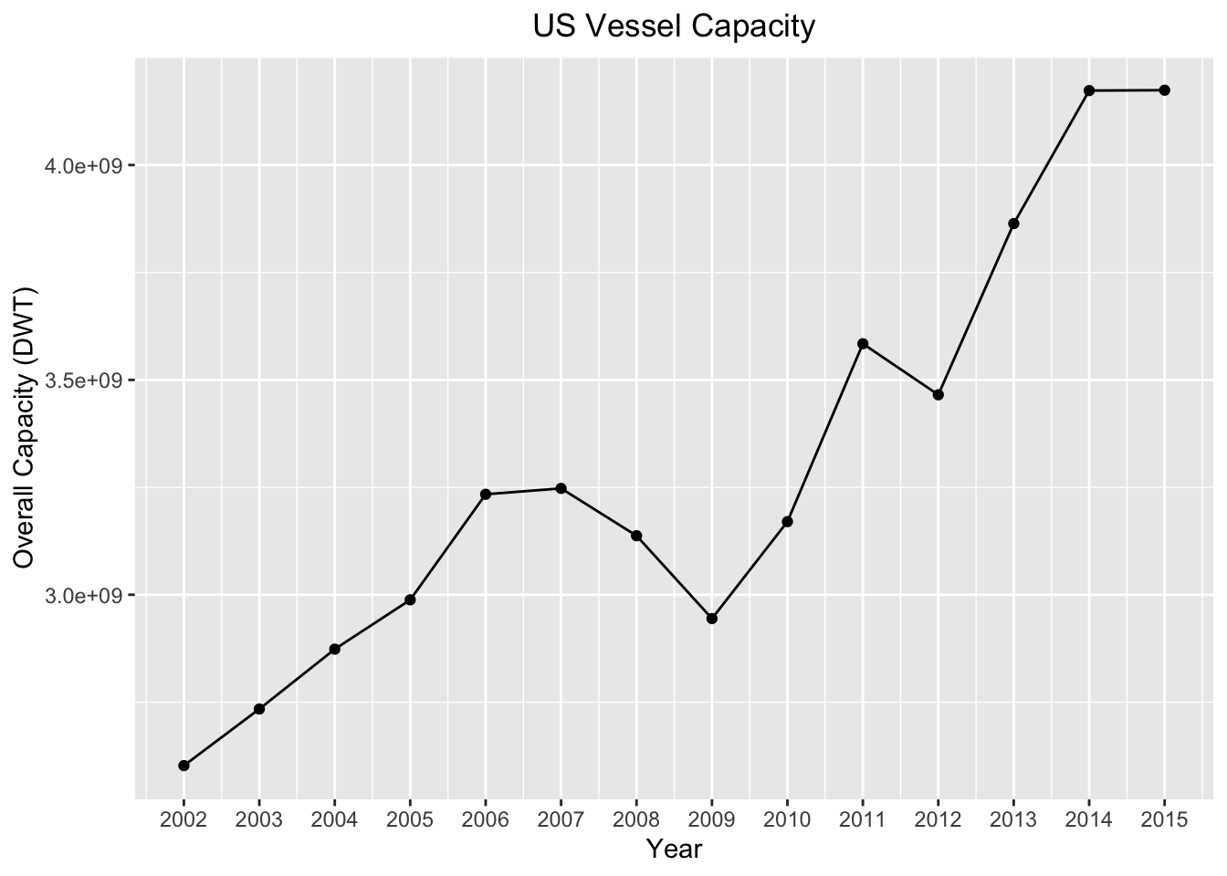
There are a couple notable observations here. The first is the drastic dip in overall capacity during the years of the financial collapse. The fact that the financial crisis had an impact on international and domestic shipping is unsurprising, though it’s still astounding to see how far-reaching the effects of the collapse were. Between 2007 and 2008 there was a 3.3% decrease in overall capacity, followed by a 6.1% decrease between 2008 and 2009!
I then break out this overall capacity by vessel type.
plotdf = meltdf[meltdf$variable!="overall_capacity",]
ggplot(plotdf,aes(x=year,y=value,colour=variable,group=variable)) +
  geom_line() +
  geom_point()  +
  xlab("Year") +
  ylab("Capacity (DWT)") +
  ggtitle("US Vessel Capacity by Vessel Type") +
  labs(color='Vessel Type') +
  theme(plot.title = element_text(hjust = 0.5))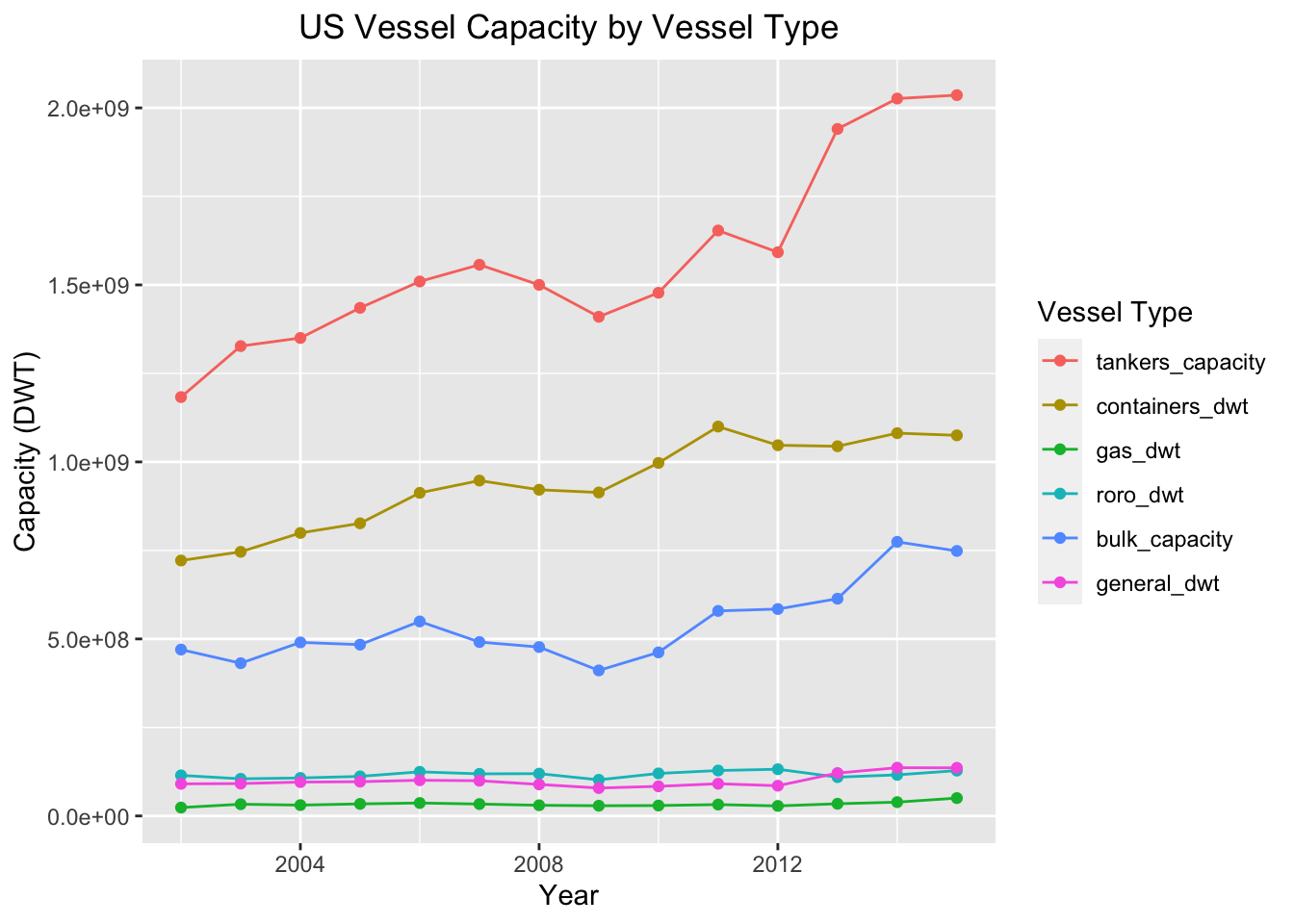
Tankers have seen the largest growth, as well as the largest overall volume, over the years out of any vessel type. This is perhaps a testament to the US’s reliance on its fleet for transporting oil and other petroleum products. We will see just how much the US uses tankers when we look at the country’s busiest ports.
Containers constitute the second biggest volume when it comes to vessel calls and capacity. Container vessels are responsibile for the majority of the international transport of goods. The large volume transported by containers reflects the US’s integration with world markets, as the world at large continues to rely on container ships to supply our goods (remember, over 90% of goods travel via the shipping industry!).
Bulk carriers too exhibited growth over the years, and most likely constitute much of the vessel call volume between US ports (also known as cabotage). In contrast, RoRo, Gas, and General vessel capacity has more or less flatlined over the years.
Below is a graph of overall calls by vessel type.
meltdf = melt(grand_df[,colnames(grand_df)[grepl("calls|year",colnames(grand_df))]],
              id=c("year"))
plotdf = meltdf[meltdf$variable!="overall_calls",]
ggplot(plotdf,aes(x=year,y=value,colour=variable,group=variable,label=value)) +
  geom_line() +
  geom_point() +
  scale_x_continuous(breaks=seq(2002,2015)) +
  geom_text(aes(label=value),vjust=0,nudge_y = 1) +
  xlab("Year") +
  ylab("Calls") +
  ggtitle("US Vessel Calls by Vessel Type") +
  labs(color='Vessel Type') +
  theme(plot.title = element_text(hjust = 0.5))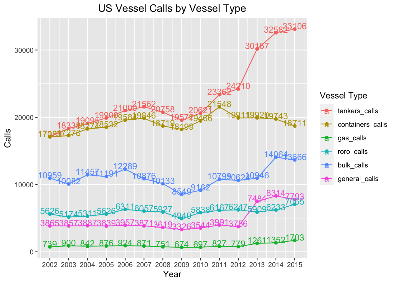
This plot gives us a more nuanced understanding of US shipping. The trends are similar to those in the capacity plot above, with a few exceptions. While we saw an increase in container vessel capacity over the years, the number of calls has actually dipped year over year in the past few years. This is a testament to the fact that many container ships are getting bigger as port infrastructure adapts to handling gigantic container vessels. We see an opposite trend with general carrier vessels in terms of capacity per vessel. The number of general vessel calls in recent years increased, while the capacity for these vessels flatlined.
Below I visualize this same call information using a Cleveland plot by vessel type and year. In this view we see more clearly that the proportion of tanker vessels increased in recent years in conjunction with an overall capacity increase.
ggplot(plotdf, aes(year, value, fill = variable)) +
  geom_bar(stat = "identity") +
  coord_flip() +
  scale_x_continuous(breaks=seq(2002,2015)) +
  xlab("Year") +
  ylab("Calls") +
  ggtitle("US Vessel Calls by Vessel Type") +
  labs(fill='Vessel Type') +
  theme(plot.title = element_text(hjust = 0.5))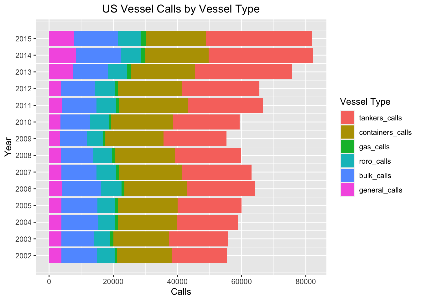
Important US Ports
Since the data is broken out by year and by port, my first inclination is to figure out which ports receive the largest annual maritime traffic.
First, I create a function to render multiple plots in a single frame.
multiplot = function(..., plotlist=NULL, file, cols=1, layout=NULL) {

  plots = c(list(...), plotlist)
  numPlots = length(plots)

  if (is.null(layout)) {
    layout = matrix(seq(1, cols * ceiling(numPlots/cols)),
                    ncol = cols, nrow = ceiling(numPlots/cols))
  }

  if (numPlots==1) {
    print(plots[[1]])

  } else {
    grid.newpage()
    pushViewport(viewport(layout = grid.layout(nrow(layout), ncol(layout))))
    for (i in 1:numPlots) {
      matchidx = as.data.frame(which(layout == i, arr.ind = TRUE))
      print(plots[[i]], vp = viewport(layout.pos.row = matchidx$row,
                                      layout.pos.col = matchidx$col))
    }
  }
}
Below, I filter the data to include only information for 2015. I then plot the ports that had the highest number of port calls for that year.
df[,colnames(df)[!(colnames(df) %in% c("port","state"))]] =
  lapply(df[,colnames(df)[!(colnames(df) %in% c("port","state"))]],as.numeric)
topdf = df[df$port!="Grand Total" & !(is.na(df$state)),]
topdf = topdf[topdf$year==2015,]

ggplot(head(topdf[order(-topdf$overall_calls),c("port","state","overall_calls")],8),
       aes(reorder(port, overall_calls), overall_calls, fill = port)) +
  coord_flip() +
  geom_bar(stat = "identity") +
  geom_text(aes(x=port, y=overall_calls, label=overall_calls,
                hjust=ifelse(sign(overall_calls)>0, 1, 0)),
            position = position_dodge(width=1)) +
  xlab("Port") +
  ylab("Calls") +
  ggtitle("Top Ports by Total 2015 Calls") +
  labs(color='Vessel Type') +
  theme(plot.title = element_text(hjust = 0.5),legend.position="none")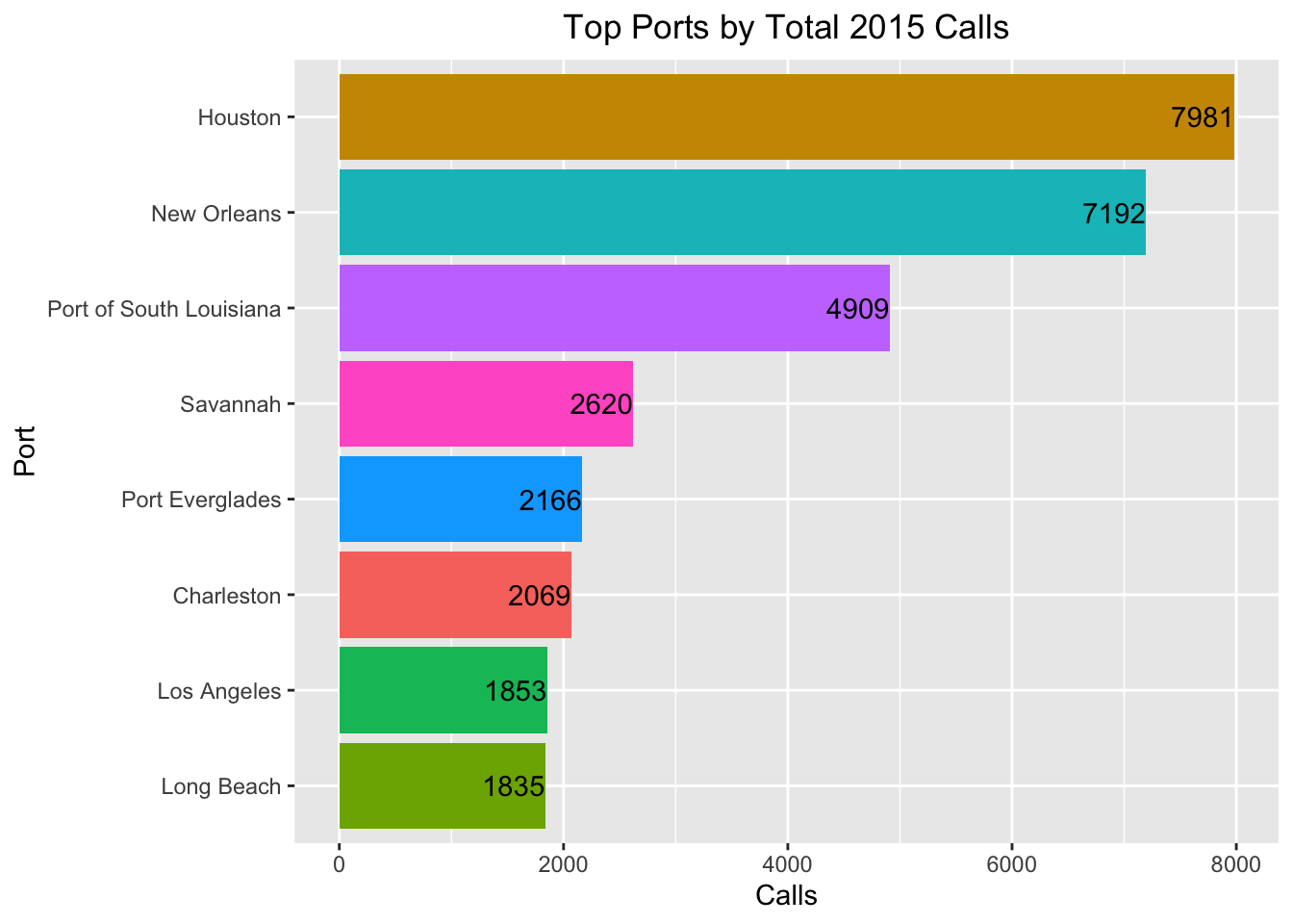
It may come as a surprise to some that Houston had the largest number of port calls. In fact, the three busiest ports in the United States that year are all on the Gulf of Mexico! Three other “southern” ports—Savannah, Georgia, Charleston, South Carolina and Port Everglades in Florida—also top the list of busiest ports.
Americans typically think of the east and west coasts as those with the strongest shipping presence and the richest maritime heritage. The fact that the most important US ports are largely concentrated on the “southern coast” of the United States may come as a surprise to many.
To create the plots below, I filter the dataset for each vessel type and plot the ports that have the highest number of calls with that vessel type.
p1 = ggplot(head(topdf[order(-topdf$tankers_calls),c("port","state","tankers_calls")],8),
            aes(reorder(port, tankers_calls), tankers_calls, fill = port)) +
  coord_flip() +
  geom_bar(stat = "identity") +
  geom_text(aes(x=port, y=tankers_calls, label=tankers_calls,
                hjust=ifelse(sign(tankers_calls)>0, 1, 0)),
            position = position_dodge(width=1)) +
  xlab("Port") +
  ylab("Calls") +
  ggtitle("Top Ports by 2015 Tanker Calls") +
  labs(color='Vessel Type') +
  theme(plot.title = element_text(hjust = 0.5),legend.position="none")

p2 = ggplot(head(topdf[order(-topdf$containers_calls),c("port","state","containers_calls")],8),
            aes(reorder(port, containers_calls), containers_calls, fill = port)) +
  coord_flip() +
  geom_bar(stat = "identity") +
  geom_text(aes(x=port, y=containers_calls, label=containers_calls,
                hjust=ifelse(sign(containers_calls)>0, 1, 0)),
            position = position_dodge(width=1)) +
  xlab("Port") +
  ylab("Calls") +
  ggtitle("Top Ports by 2015 Container Calls") +
  labs(color='Vessel Type') +
  theme(plot.title = element_text(hjust = 0.5),legend.position="none")

p3 = ggplot(head(topdf[order(-topdf$gas_calls),c("port","state","gas_calls")],8),
            aes(reorder(port, gas_calls), gas_calls, fill = port)) +
  coord_flip() +
  geom_bar(stat = "identity") +
  geom_text(aes(x=port, y=gas_calls, label=gas_calls,
                hjust=ifelse(sign(gas_calls)>0, 1, 0)),
            position = position_dodge(width=1)) +
  xlab("Port") +
  ylab("Calls") +
  ggtitle("Top Ports by 2015 LNG Carrier Calls") +
  labs(color='Vessel Type') +
  theme(plot.title = element_text(hjust = 0.5),legend.position="none")

p4 = ggplot(head(topdf[order(-topdf$roro_calls),c("port","state","roro_calls")],8),
            aes(reorder(port, roro_calls), roro_calls, fill = port)) +
  coord_flip() +
  geom_bar(stat = "identity") +
  geom_text(aes(x=port, y=roro_calls, label=roro_calls,
                hjust=ifelse(sign(roro_calls)>0, 1, 0)),
            position = position_dodge(width=1)) +
  xlab("Port") +
  ylab("Calls") +
  ggtitle("Top Ports by 2015 RoRo Calls") +
  labs(color='Vessel Type') +
  theme(plot.title = element_text(hjust = 0.5),legend.position="none")

p5 = ggplot(head(topdf[order(-topdf$bulk_calls),c("port","state","bulk_calls")],8),
            aes(reorder(port, bulk_calls), bulk_calls, fill = port)) +
  coord_flip() +
  geom_bar(stat = "identity") +
  geom_text(aes(x=port, y=bulk_calls, label=bulk_calls,
                hjust=ifelse(sign(bulk_calls)>0, 1, 0)),
            position = position_dodge(width=1)) +
  xlab("Port") +
  ylab("Calls") +
  ggtitle("Top Ports by 2015 Bulk Carrier Calls") +
  labs(color='Vessel Type') +
  theme(plot.title = element_text(hjust = 0.5),legend.position="none")

p6 = ggplot(head(topdf[order(-topdf$general_calls),c("port","state","general_calls")],8),
            aes(reorder(port, general_calls), general_calls, fill = port)) +
  coord_flip() +
  geom_bar(stat = "identity") +
  geom_text(aes(x=port, y=general_calls, label=general_calls,
                hjust=ifelse(sign(general_calls)>0, 1, 0)),
            position = position_dodge(width=1)) +
  xlab("Port") +
  ylab("Calls") +
  ggtitle("Top Ports by 2015 General Carrier Calls") +
  labs(color='Vessel Type') +
  theme(plot.title = element_text(hjust = 0.5),legend.position="none")

multiplot(p1, p2, cols=2)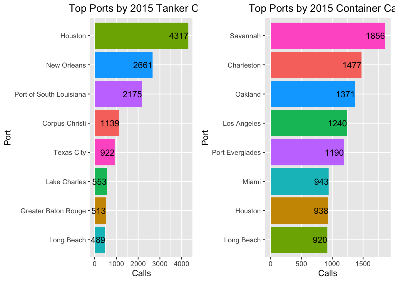
multiplot(p3, p4, cols=2)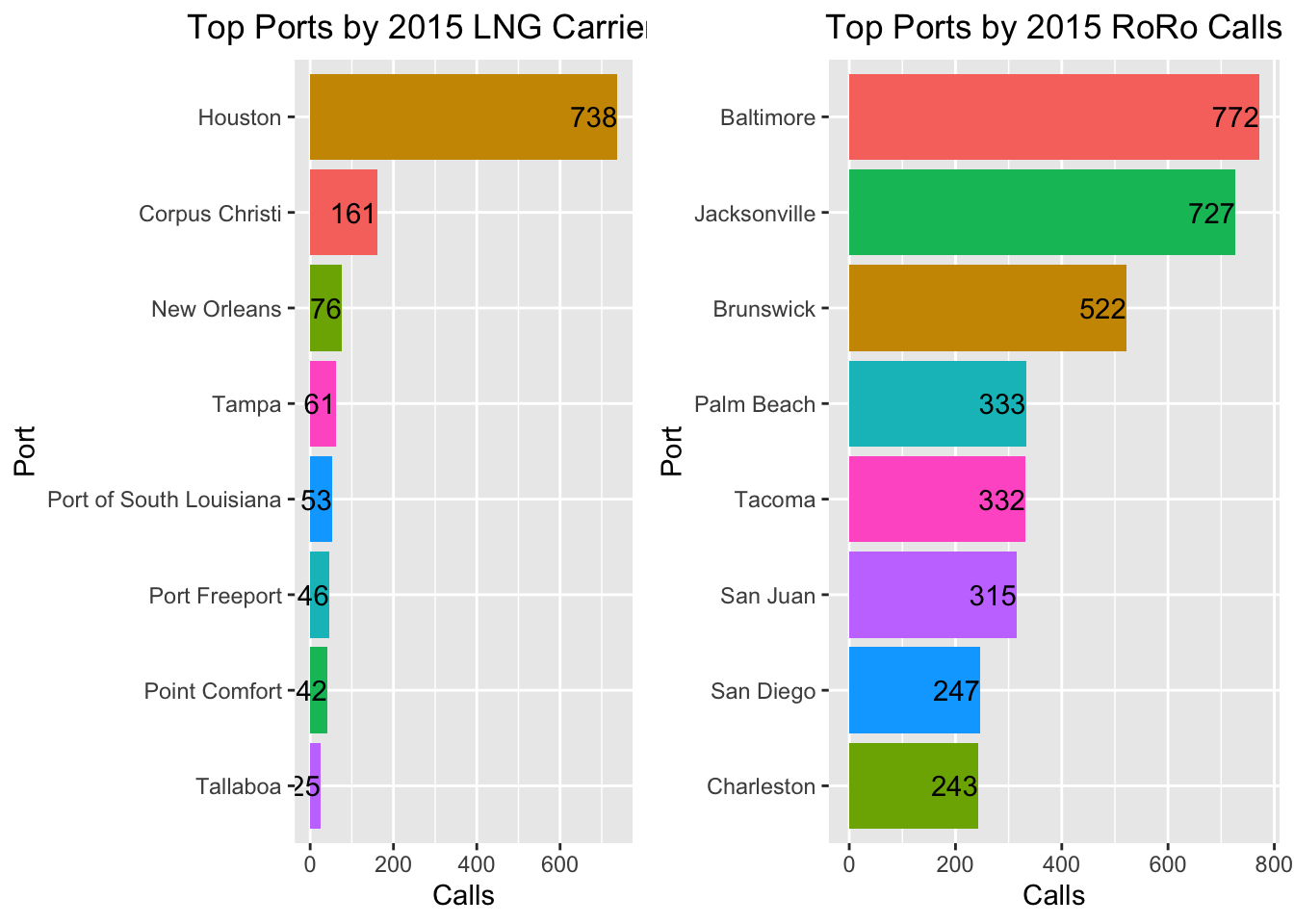
multiplot(p5, p6, cols=2)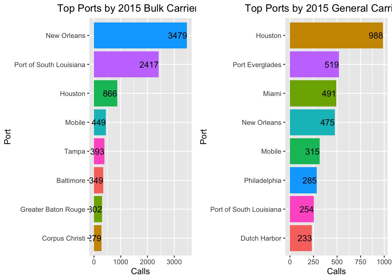 There is a lot to uncover here. Let’s start with the US’s busiest port, Houston. We can see that the port’s traffic consists mostly of Tanker, Bulk Carrier, and especially LNG calls. Given it’s position on the gulf, Houston is not poised to receive international container traffic. Instead, the port’s maritime traffic consists mostly of vessels that are characteristically involved with transporting Texas’ most notable export: oil. The port also transports by far the most liquified natural gas (“LNG”) cargo in comparison to the rest of the US’s maritime traffic.
Looking at container calls, Savannah is by far the busiest port. Before looking at this graph I would not have guessed that Savannah has the container presence that it does. In fact, container traffic characterizes many other ports on the southeast coast of the US, including Charleston, Port Everglades and Miami.
Interestingly, southern ports also dominate the bulk carrier traffic in the US. Only one port not typically associated with the south, Baltimore, ranks among the top 8 ports by bulk carrier calls (though it is technically below the Mason-Dixon line!). Louisiana ports command the greatest share of bulk carrier calls. New Orleans and the port of South Louisiana by a large margin outpace Houston in terms of total 2015 bulk carrier calls.
A final observation here pertains to the RoRo vessel traffic. Baltimore overshadows many other ports when it comes to RoRo traffic, while Jacksonville comes in a close second. Apparently, the city of Baltimore cultivated its roro traffic niche and devoted over 200 acres of pavement devoted to offloading roro cargo, making it the roro traffic hub on the east coast. Who knew a city could pride themselves on something as niche as being the roro cargo capital of the US.
The State of US Ports…by State
Looking at individual ports yields some interesting insights into US port traffic. Equally interesting is looking at the port traffic in entire states, and seeing which states play the largest part in American vessel traffic.
To compare states to each other, I summarized the data by state and looked not only at overall calls and capacity but also at the calls and capacity of each state broken out by vessel type.
I then used kmeans clustering to look at how the port system in each of the individual states compare to one another. Kmeans clustering is an unsupervised clustering method, so one must specify the number of clusters before running the algorithm. I chose to group the states into 5 clusters.
topdf = df[df$port!="Grand Total",]
topdf = topdf[topdf$year==2015,]
topdf = topdf[!(is.na(topdf$state)),]
topdf[is.na(topdf)] = 0
state_df = do.call(data.frame,
                   aggregate(cbind(overall_calls,overall_capacity,tankers_calls,tankers_capacity,
                                   containers_calls,containers_dwt,gas_calls,gas_dwt,
                                   roro_calls,roro_dwt,bulk_calls,
                                   bulk_capacity,general_calls,general_dwt)~state,
                             data = topdf, FUN = function(x) c(mn = mean(x), sm = sum(x))))
state_df$aver_capacity = state_df$overall_capacity.sm/state_df$overall_calls.sm
state_df[is.na(state_df)] = 0
fit = kmeans(state_df[,c(2:length(state_df))],5)
state_df$cluster = fit$cluster
To get a sense of the size of the clusters and the states in each one, I plotted the states by overall vessel calls and total capacity and colored them based on their cluster:
ggplot(state_df, aes(x= overall_calls.sm, y= overall_capacity.sm,
                     label=state,colour = factor(cluster)))+
  geom_point() +
  geom_text(aes(label=state),hjust=0,vjust=0,
            check_overlap = TRUE) +
  scale_color_discrete() +
  labs(x = "Calls", y = "Total Capacity",colour = "Cluster") + ggtitle("Port Clusters") +
  theme(plot.title = element_text(hjust = 0.5))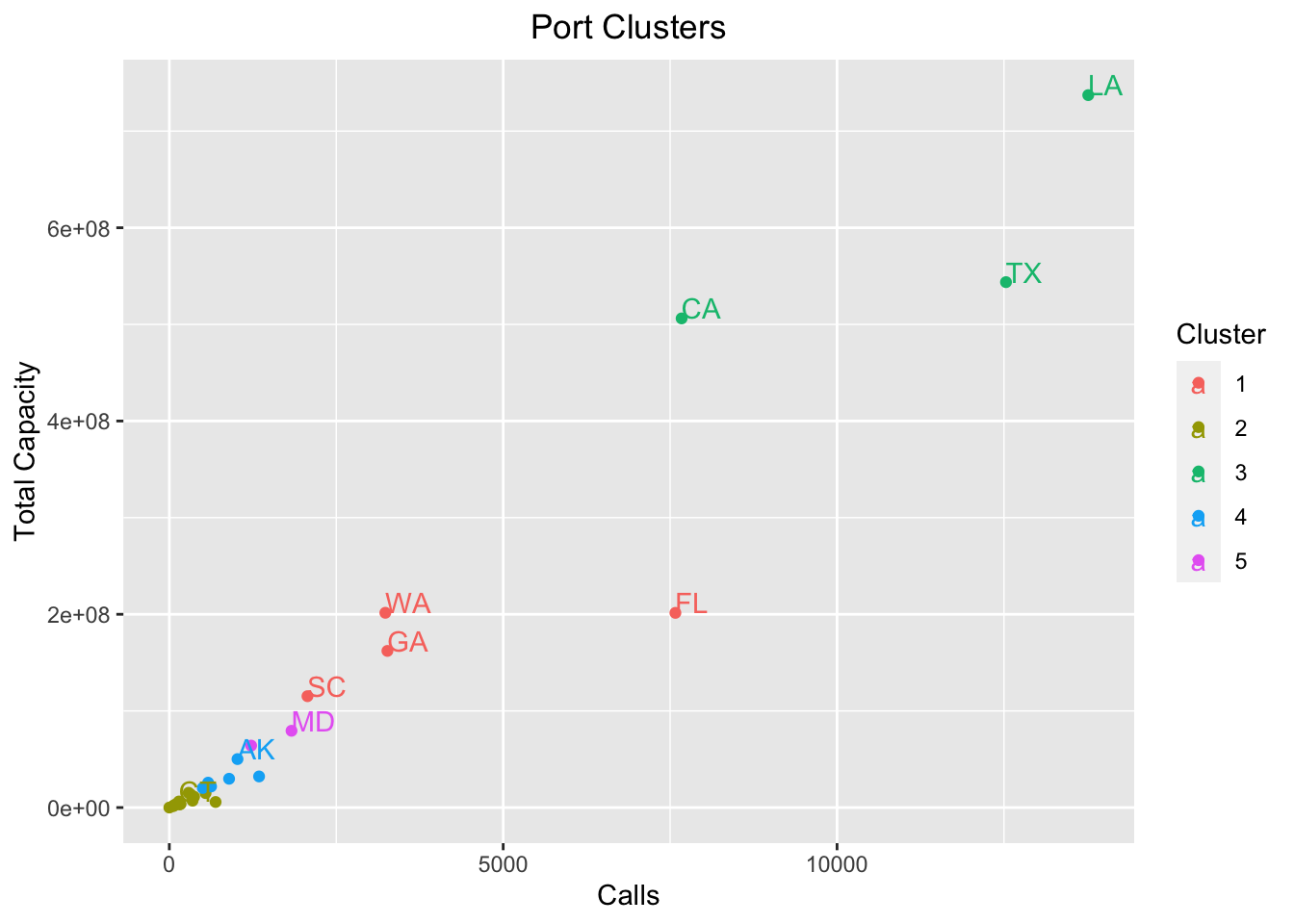
It’s evident that the Louisiannan, Texan, and Californian port systems are in a league of their own. The size of their ports put them in their own clusters, and looking at the plot it’s clear that this makes sense given their distance from the states in the second cluster.
Coming from Rhode Island, it’s interesting to note that Rhode Island is grouped among the other New England ports in their own cluster. The one exception is Massachusetts. In grouping these states by kmeans, it’s interesting to note that Massachusetts is more similar to Alaska, Puerto Rico and North Carolina in its port activity than it is to the other New England states.
To get a better sense of which states are in Rhode Island’s cluster, since it is hard to tell from the above graph, we can look at the plot below:
ggplot(state_df[state_df$cluster==state_df$cluster[state_df$state=="RI"]&state_df$state!="RI",],
       aes(x= overall_calls.sm, y= overall_capacity.sm,label=state))+
  geom_point() +
  geom_text(aes(label=state),hjust=0,vjust=0,check_overlap = TRUE) +
  scale_color_discrete() +
  geom_point(data=state_df[state_df$state=="RI",], colour="red") +  # this adds a red point
  geom_text(data=state_df[state_df$state=="RI",], label="RI",hjust=1,vjust=0,check_overlap = TRUE) +
  labs(x = "Calls", y = "Total Capacity",colour = "Cluster") + ggtitle("States in RI Cluster") +
  theme(plot.title = element_text(hjust = 0.5))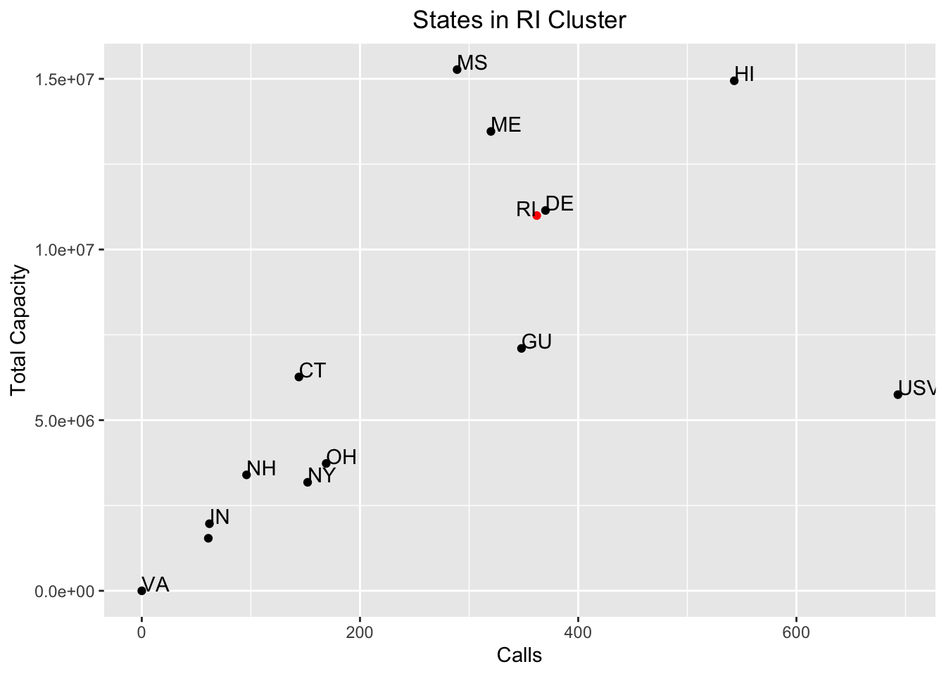
Looking at the Rhode Island dot in red, it appears as though it shares the most similarities with the second smallest state in the US: Delaware. However, it will take a little more work to determine which state is closest to Rhode Island.
Comparing Shipping in New England to other US States
Kmeans allowed us to choose the number of clusters into which we wanted to group different states. However, if we want to get a sense of which state is mathematically closest to another, we’ll have to build out some new code.
The code snippet below computes, for all states in 2015, which state is closest to it using a simple distance metric called Euclidean distance. I save the close matches in a new column in the state_df dataframe.
state_df$dist = NA

state_df$match = NA

for(i in 1:nrow(state_df)){

  bb = state_df[state_df$state!=state_df[i,]$state,]

  bb$dist = apply(bb[,2:(length(bb)-2)],1,function(x) sqrt(sum((state_df[i,2:(length(state_df)-2)]-x)^2)))

  mindist = min(bb$dist)

  state_df$match[i] = paste(bb$state[bb$dist==mindist])[1]

  state_df$dist[i] = mindist

  gc()

}
Below I print the state whose port activity looks most similar to my home state of Rhode Island, as well as to neighboring Massachusetts. Unsurprisingly, the state most similar to Rhode Island is our neighor to the west, Connecticut.
Though Rhode Island has many more vessel calls than Connecticut, the overall vessel call makeup between the two states is very similar. Both states’ have a similar mix of vessel calls that revolve around bulk carrier, general vessel, and tanker vessel traffic.
The pairing of Massachusetts with North Carolina is much more surprising. However, looking at the data it’s clear that both states have a similar number of vessel calls and total vessel capacity. It’s also interesting to see that the two states have very similar vessel call compositions, i.e. a roughly equal number of bulk carrier and tanker calls and capacity.
## [1] "The state closest to RI is: CT"## [1] "The state closest to MA is: NC"The following are the New England states and their closest state matches. Vermont did not have any registered vessel calls in 2015, so that state is excluded from the list. Another non-intuitive pairing arises with Maine and Missouri. However, looking at their port characteristics brings to light their similarities: their vessel traffic consists primarily of bulk carrier, tanker, and general vessel calls, and their overall number of calls and capacity are within one standard deviation of each other.
##    state match
## 4     CT    NH
## 12    MA    NC
## 14    ME    MS
## 18    NH    NY
## 24    RI    CT
A Look at RI Ports
As a native Rhode Islander, I’m interested in looking at my state’s port activity over the years. My hometown of North Kingstown contains Quonset Point, which not only is the native land of the Seabees and the birthplace of the Quonset hut, but also is the home of the port of Davisville. Below, I plot the vessel activity for Rhode Island over the years, which includes traffic for the ports of the capital city Providence, the coastal city Newport, and my “home port” of Davisville.
#dataframe that includes only RI ports
ri_df = df[df$state=="RI",]
ri_df = ri_df[!(is.na(ri_df$state)),]
ri_df[,colnames(ri_df)[!colnames(ri_df) %in% c("port","state")]] =
  lapply(ri_df[,colnames(ri_df)[!colnames(ri_df) %in% c("port","state")]],as.numeric)
ri_df[is.na(ri_df)] = 0

#prepare dataframe for plotting time series
meltdf = melt(ri_df[,colnames(ri_df)[grepl("calls|year|port|overall_capacity",colnames(ri_df))]],
              id=c("year","port"))

plotdf = meltdf[meltdf$variable=="overall_calls",]
plotdf = plotdf[order(plotdf$port,plotdf$year),]

#plot over time
ggplot(plotdf,aes(x=year,y=value,colour = port)) +
  geom_line() +
  geom_point() +
  scale_x_continuous(breaks=seq(2002,2015)) +
  xlab("Year") +
  ylab("Vessel Calls") +
  labs(colour = "Port") +
  ggtitle("RI Ports: Total Vessel Calls") +
  theme(plot.title = element_text(hjust = 0.5))
Providence dominated port traffic in Rhode Island over the years, with its highest number of vessel calls in 2005. It’s interesting to note, however, that in a three year span between 2006 and 2009 Davisville actually had more vessel calls—while Providence calls dwindled almost to zero. In a similar way, Davisville calls decreased to zero between 2013 and 2014, but spiked in 2015 and reached just about the same number of vessel calls as Providence.
Newport received port calls only in 2013 and 2014. We will see in the next few graphs that Newport’s traffic consists only of a few container calls.
I now plot the total capacity over time for these ports.
plotdf = meltdf[meltdf$variable=="overall_capacity",]
ggplot(plotdf,aes(x=year,y=value,colour = port)) +
  geom_line() +
  geom_point() +
  scale_x_continuous(breaks=seq(2002,2015)) +
  xlab("Year") +
  ylab("Overall Capacity (DWT)") +
  labs(colour = "Port") +
  ggtitle("RI Ports: Vessel Capacity") +
  theme(plot.title = element_text(hjust = 0.5))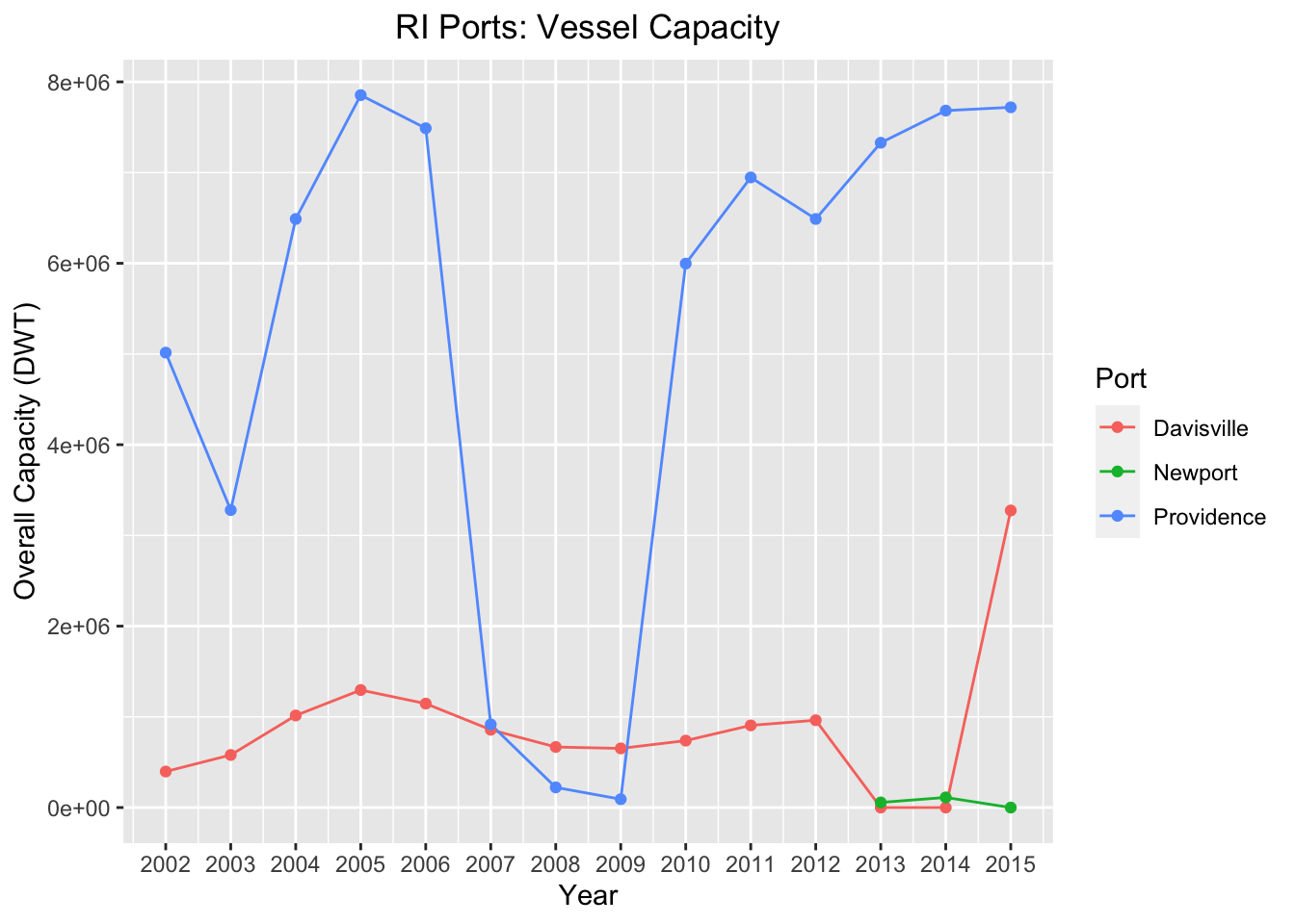
While the gap between Providence and Davisville port calls appears slim, that gap widens when looking at vessel capacity. Looking at 2015, Providence only had a few more vessel calls, but the overall capacity for that year outpaces Davisville’s overall capacity.
This discrepancy in vessel capacity signals that the vessel type makeup differs between these ports. For insight into the different vessel compositions, I plot overall calls by vessel type and year for all RI ports.
plotdf = meltdf[!(meltdf$variable %in% c("overall_capacity","overall_calls")),]
plotdf2 = aggregate(value ~ port + variable,data=plotdf, FUN = sum)
ggplot(plotdf2, aes(port, value, fill = variable)) +
  geom_bar(stat = "identity") +
  coord_flip() +
  xlab("Port") +
  ylab("Calls") +
  ggtitle("RI Vessel Calls by Vessel Type") +
  labs(color='Vessel Type',fill = "Vessel Type") +
  theme(plot.title = element_text(hjust = 0.5))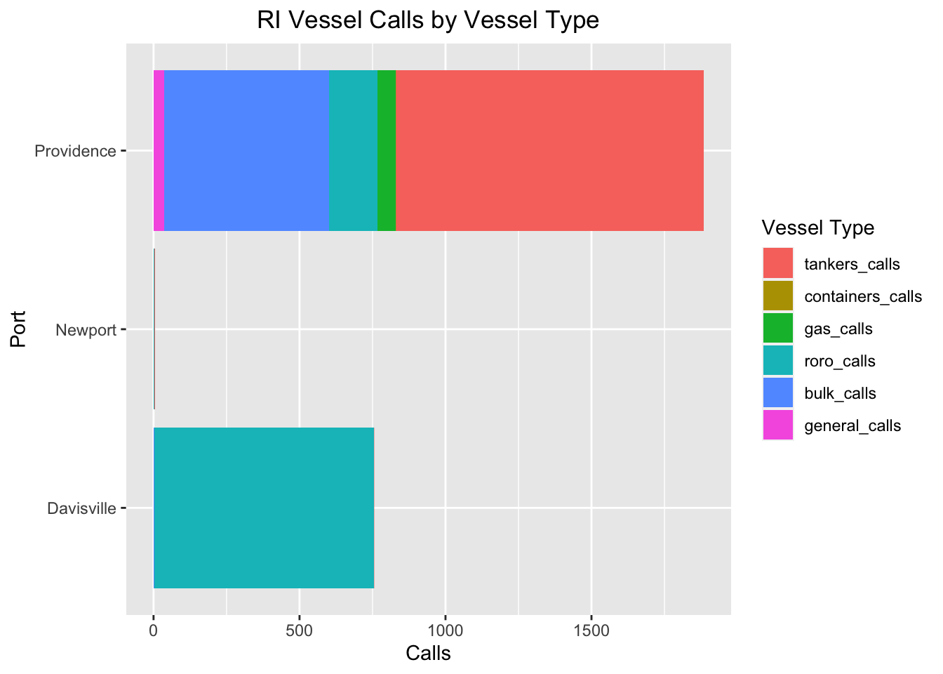
Growing up near Davisville, it’s unsurprising to see that the vehicle makeup for the port consists of one vessel type: roro vessels. This is due to the large presence of NORAD, which is one of the largest ports in the US for automotive imports. In contrast, Providence traffic is much more varied, and consists of vessel calls of all different vessel types. The most dominant vessel calls are tanker vessel calls. These ships are often very large—about equivalent in size to roro carriers or bigger—so it makes sense that Providence vessel capacity outpaces Davisville’s capacity for most years. Newport, in contrast, received only 3 tanker calls in only 2 years.
Finally, here is RI vessel calls by vessel type and year.
plotdf = meltdf[!(meltdf$variable %in% c("overall_capacity","overall_calls")),]
ggplot(plotdf, aes(year, value, fill = variable)) +
  geom_bar(stat = "identity") +
  coord_flip() +
  scale_x_continuous(breaks=seq(2002,2015)) +
  xlab("Year") +
  ylab("Calls") +
  ggtitle("RI Vessel Calls by Vessel Type") +
  labs(color='Vessel Type',fill = "Vessel Type") +
  theme(plot.title = element_text(hjust = 0.5))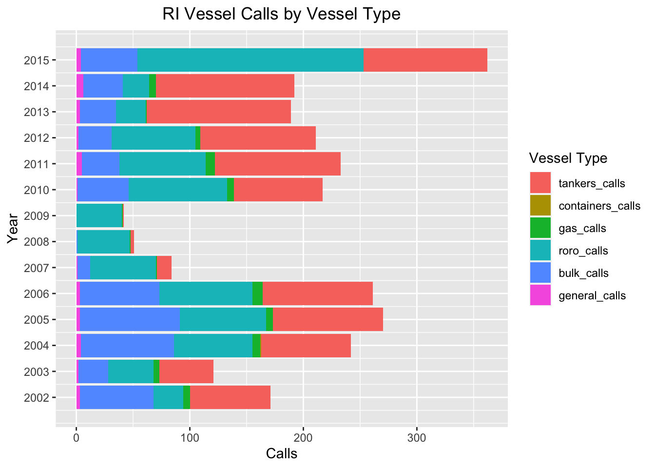
We see that 2015 was the biggest year for RI vessel traffic, thanks in large part due to an outsized proportion of roro calls courtesy of Davisville! We also see the downturn in vessel activity between 2007 and 2009, in the wake of the financial collapse, when roro vessel traffic from Davisville dominated the overall Rhode Island vessel traffic.
Comparing New England Ports to US Ports
Finally, I chose to run a similar analysis comparing port systems across states, except now I compare each individual port in the dataset for 2015. The code below finds, for all 99 ports, the closest “sister port” using Euclidean distance.
port_df = df[df$state!="Grand Total"&df$year==2015,]
port_df = port_df[!(is.na(port_df$state)),
                  colnames(port_df)[!colnames(port_df) %in% c("year")]]
port_df[,colnames(port_df)[!colnames(port_df) %in% c("port","state")]] =
  lapply(port_df[,colnames(port_df)[!colnames(port_df) %in% c("port","state")]],as.numeric)
port_df[is.na(port_df)] = 0

port_df$dist = NA
port_df$match = NA
port_df$match_state = NA

for(i in 1:nrow(port_df)){

  bb = port_df[port_df$port!=port_df[i,]$port,]

  bb$dist = apply(bb[,3:(length(bb)-3)],1,function(x) sqrt(sum((port_df[i,3:(length(port_df)-3)]-x)^2)))

  mindist = min(bb$dist)

  port_df$match[i] = paste(bb$port[bb$dist==mindist])[1]

  port_df$match_state[i] = paste(bb$state[bb$dist==mindist])[1]

  port_df$dist[i] = mindist

  gc()

}
So what is the “sister port” for my home port of Davisville, RI? The answer to me is surprising:
## [1] "The port closest to Davisville is: St. Thomas"St. Thomas in the United States Virgin Islands is the closest match! As one might expect, St. Thomas (though it has more vessel traffic overall) has nearly the same amount of roro traffic as does Davisville, which explains the close match.
I then plot the “sister ports” for each Rhode Island port below:
## # A tibble: 3 x 4
##   port       state match          match_state
##   <chr>      <chr> <chr>          <chr>
## 1 Davisville RI    St. Thomas     USVI
## 2 Newport    RI    Georgetown     SC
## 3 Providence RI    Port Canaveral FL
Here too are some interesting matches, in particular with Providence matched with Port Canaveral. A look at the data shows that Port Canaveral has a diverse array of vessel calls of similar capacity as does Providence, making the two a close fit.
Finally, I print the “sister ports” for each port in each New England state:
## # A tibble: 13 x 4
##    port       state match          match_state
##    <chr>      <chr> <chr>          <chr>
##  1 Boston     MA    San Juan       PR
##  2 Bridgeport CT    Georgetown     SC
##  3 Bucksport  ME    Everett        MA
##  4 Davisville RI    St. Thomas     USVI
##  5 Everett    MA    Tallaboa       PR
##  6 Fall River MA    Toledo         OH
##  7 New Haven  CT    Port Canaveral FL
##  8 New London CT    Ponce          PR
##  9 Newport    RI    Georgetown     SC
## 10 Portland   ME    Providence     RI
## 11 Portsmouth NH    Searsport      ME
## 12 Providence RI    Port Canaveral FL
## 13 Searsport  ME    Martinez       CA
That concludes this analysis. Maritime transport is one of the most important—but also one of the most invisible—components of our modern economy. We take for granted the quick transport of goods in large part due to maritime transport (once more, over 90% of goods travel via the shipping industry!). In this light, it’s important to get a sense of what our country’s port activity looks like, because in many ways it mirrors larger trends that characterize our economy.
I’ll finish this post with a look at my home port of Davisville:

Quonset Port