Introduction
With the runoff mayoral election looming, Chicago is set to make history. The city will become the largest American city ever to elect a female person of color as mayor. I was curious at how common it is for women to be mayors, as well as how often people of color govern cities in today’s political landscape. Unfortunately, I could not find an aggregated source of information on the ethnicites and genders of mayors. What I did find is this list on Ballotpedia, which includes links to easily-scraped data on the mayors of the largest 100 cities in United States. I also gathered information specific to each city, such as demographics and economics indicators like unemployment and median income. I built the scraper in Python, which you can view here.
Below I analyze this dataset using Python for data processing and some initial analysis, and R for building plots for further exploratory analysis. Interesting differences arise between the cities that elect women and those that elect people of color. Cities that elect women are less African-American, and on average are smaller. Cities that elect people of color as mayor, on the other hand, have smaller fiscal budgets than cities without a person of color as mayor. To assess how differences in city demographics and other characteristics interact and influence the ethnicity and sex of elected mayors, I also perform regression analysis using R.
Process Data
First we read in the dataset. Below is a full list of the columns and the variable types. There is a mix of information specific to the office (i.e. term_ends, took_office, gov_type), data specific to the city (i.e. median_income, unemployment and the ethnicity variables starting in perc_), and variables specific to individual mayors (mayor_gender_f_1, mayor_race_nonwhite_1).
import pandas as pd
import os
import re
df = pd.ExcelFile("./mayors/mayors_data.xlsx").parse("Sheet1")
print(df.info())
## <class 'pandas.core.frame.DataFrame'>
## RangeIndex: 100 entries, 0 to 99
## Data columns (total 39 columns):
## Unnamed: 0 100 non-null int64
## city_name 100 non-null object
## city_url 100 non-null object
## gov_type 100 non-null object
## mayor_name 100 non-null object
## mayor_url 100 non-null object
## term_ends 100 non-null int64
## took_office 100 non-null int64
## 2013_population 100 non-null int64
## city_council_seats 100 non-null int64
## city_seal 100 non-null object
## college_grad_rate 100 non-null float64
## ethnicity 93 non-null float64
## fiscal_year_budget 100 non-null object
## gender 100 non-null float64
## hs_grad_rate 100 non-null float64
## last_city_council_election 100 non-null object
## last_mayoral_election 100 non-null object
## mayor_party 87 non-null object
## mayor_pic 99 non-null object
## median_income 100 non-null int64
## next_city_council_election 100 non-null object
## next_mayoral_election 100 non-null object
## race 100 non-null object
## total_budget 100 non-null object
## unemployment 99 non-null float64
## budget 100 non-null int64
## race_json 100 non-null object
## perc_asian 100 non-null float64
## perc_hispanic 1 non-null float64
## perc_white 100 non-null float64
## perc_white_not_hispanic 12 non-null float64
## perc_african_american 100 non-null float64
## perc_native_american 100 non-null float64
## perc_pacific_islander 100 non-null float64
## perc_two_or_more 100 non-null float64
## mayor_gender_f_1 100 non-null int64
## mayor_race_nonwhite_1 100 non-null int64
## mayor_race 100 non-null object
## dtypes: float64(13), int64(9), object(17)
## memory usage: 30.5+ KB
## NoneIn the scraper that I linked to above, we already performed a great deal of the nitty-gritty data processing. However, there are a few tweaks to the dataset we need to make before any analysis. The first is retrieving the party from the name of the mayor. For whatever reason, the party information is lacking on each mayor’s individual page on Ballotpedia, but the mayor’s party exists attached the mayor_name column in the dataset as shown below.
print(df.mayor_name.head())## 0 Bill de Blasio (D)
## 1 Eric Garcetti (D)
## 2 Rahm Emanuel (D)
## 3 Sylvester Turner (D)
## 4 James Kenney (D)
## Name: mayor_name, dtype: objectUsing regular expressions, I create two simple functions to extract each mayor’s party affiliation, and clean up the name column. I use the handy map function in the pandas package to create the new party variable. Below are the cleaned up columns:
#retrieve party
def find_party(x):
  try:
    return(re.search('\((.*?)\)', x).group(1))
  except:
    return(None)
df["party"] = df.mayor_name.map(find_party)
#clean up mayor name
def trim_name(x):
  try:
    return(re.sub(r"\((.*?)\)", "",x))
  except:
    return(x)
df["mayor_name"] = df["mayor_name"].map(trim_name)
print(df[["mayor_name","party"]].tail())
## mayor_name party
## 95 Lily Mei I
## 96 David Bieter D
## 97 John Valdivia I
## 98 Randall L. Woodfin D
## 99 Levar Stoney DThere is still some missing party information for a few mayors, but after a quick search on Wikipedia I was able to track down the missing data. I make manual edits below.
#manual party edits
print(df[["mayor_name","party"]][df.party.isnull()])
## mayor_name party
## 23 David Briley None
## 68 Harry LaRosiliere None
## 90 Jenn Daniels Nonedf.loc[df["mayor_name"] == "David Briley","party"] = "D"
df.loc[df["mayor_name"] == "Harry LaRosiliere","party"] = "R"
df.loc[df["mayor_name"] == "Jenn Daniels","party"] = "I"Descriptive Stats in Python
To begin the analysis, let’s start by getting some basic value counts. Below we see that there are many more Democratic mayors in the 100 largest cities in the U.S. than there are Republican and independent mayors.
print(df['party'].value_counts())## D 61
## R 25
## I 14
## Name: party, dtype: int64We now look at the number of offices by government type. The government type defines the power structure and the way that responsibility is allocated between the city council and the mayor. For a good description on the differences between each type, read the Ballotpedia page here.
print(df['gov_type'].value_counts())## Strong mayor 46
## Council-manager 46
## Hybrid 6
## Strong mayor* 1
## City commission 1
## Name: gov_type, dtype: int64Below is the number of mayors that are male and female in the top 100 cities. I also print the cities that have female mayors. We see that the majority of mayors are men.
print(df['mayor_gender_f_1'].value_counts())## 0 77
## 1 23
## Name: mayor_gender_f_1, dtype: int64print(df[["mayor_name","city_name"]][df.mayor_gender_f_1==1])## mayor_name city_name
## 5 Thelda Williams Phoenix, Arizona
## 13 London Breed San Francisco, California
## 15 Vi Lyles Charlotte, North Carolina
## 16 Betsy Price Fort Worth, Texas
## 20 Jenny Durkan Seattle, Washington
## 24 Catherine Pugh Baltimore, Maryland
## 28 Carolyn Goodman Las Vegas, Nevada
## 38 Keisha Bottoms Atlanta, Georgia
## 40 Jean Stothert Omaha, Nebraska
## 41 Nancy McFarlane Raleigh, North Carolina
## 43 Elizabeth "Libby" Schaaf Oakland, California
## 49 LaToya Cantrell New Orleans, Louisiana
## 50 Karen Goh Bakersfield, California
## 56 Lyda Krewson St. Louis, Missouri
## 59 Linda Gorton Lexington, Kentucky
## 66 Nancy B. Vaughan Greensboro, North Carolina
## 69 Debra March Henderson, Nevada
## 73 Mary Salas Chula Vista, California
## 86 Lori Barnett Dodson Garland, Texas
## 88 Hillary Schieve Reno, Nevada
## 90 Jenn Daniels Gilbert, Arizona
## 91 Sharon Weston Broome Baton Rouge, Louisiana
## 95 Lily Mei Fremont, CaliforniaBelow is the number of mayors that are people of color in the top 100 cities. Please note that the information on sex and ethnicity did not exist in the original dataset pulled from Ballotpedia. I manually entered this data by looking at each mayor’s Wikipedia page. Race (and gender) are subjective terms, so this part of the dataset is subject to my bias. Nonetheless, we see that majority of mayors are white.
print(df['mayor_race_nonwhite_1'].value_counts())## 0 78
## 1 22
## Name: mayor_race_nonwhite_1, dtype: int64print(df[["mayor_name","city_name","mayor_race"]][df.mayor_race_nonwhite_1==1])## mayor_name city_name mayor_race
## 3 Sylvester Turner Houston, Texas black
## 13 London Breed San Francisco, California black
## 15 Vi Lyles Charlotte, North Carolina black
## 21 Michael B. Hancock Denver, Colorado black
## 24 Catherine Pugh Baltimore, Maryland black
## 35 Sly James Kansas City, Missouri black
## 38 Keisha Bottoms Atlanta, Georgia black
## 42 Francis Suarez Miami, Florida hispanic
## 49 LaToya Cantrell New Orleans, Louisiana black
## 54 Harry Sidhu Anaheim, California indian/asian/sikh
## 55 Miguel Pulido Santa Ana, California hispanic
## 62 Michael Tubbs Stockton, California black
## 64 Melvin Carter III St. Paul, Minnesota black
## 67 Ras J. Baraka Newark, New Jersey black
## 68 Harry LaRosiliere Plano, Texas black
## 71 Byron Brown Buffalo, New York black
## 73 Mary Salas Chula Vista, California hispanic
## 79 Kenneth Alexander Norfolk, Virginia black
## 91 Sharon Weston Broome Baton Rouge, Louisiana black
## 95 Lily Mei Fremont, California asian/pacific islander
## 98 Randall L. Woodfin Birmingham, Alabama black
## 99 Levar Stoney Richmond, Virginia blackFinally, since Chicago is set to be the largest city ever in the U.S. to ever have a female person of color as mayor, I print the 8 cities where this condition is met. 3 of these cities are in California, and 2 are in Louisiana.
print(df[["mayor_name","city_name"]][(df.mayor_race_nonwhite_1==1)&(df.mayor_gender_f_1==1)])## mayor_name city_name
## 13 London Breed San Francisco, California
## 15 Vi Lyles Charlotte, North Carolina
## 24 Catherine Pugh Baltimore, Maryland
## 38 Keisha Bottoms Atlanta, Georgia
## 49 LaToya Cantrell New Orleans, Louisiana
## 73 Mary Salas Chula Vista, California
## 91 Sharon Weston Broome Baton Rouge, Louisiana
## 95 Lily Mei Fremont, CaliforniaMost of the interesting features are numeric. Before we transition to R to build plots, below we print the distribution of all the numeric variables in the dataset.
numerics = ['int64','float64']
print(df.select_dtypes(include=numerics).iloc[:,1:5].describe())
## term_ends took_office 2013_population city_council_seats
## count 100.000000 100.000000 1.000000e+02 100.000000
## mean 2020.390000 2013.880000 6.165657e+05 11.020000
## std 1.109145 4.297709 9.481099e+05 7.774577
## min 2019.000000 1994.000000 2.078780e+05 5.000000
## 25% 2019.000000 2012.750000 2.562428e+05 7.000000
## 50% 2020.000000 2015.000000 3.711725e+05 9.000000
## 75% 2021.000000 2017.000000 6.134858e+05 11.250000
## max 2023.000000 2019.000000 8.400000e+06 51.000000print(df.select_dtypes(include=numerics).iloc[:,5:10].describe())## college_grad_rate ethnicity gender hs_grad_rate median_income
## count 100.000000 93.000000 100.000000 100.000000 100.000000
## mean 0.312150 0.252462 0.510220 0.839330 49840.810000
## std 0.104223 0.213394 0.009574 0.065322 13395.317378
## min 0.118000 0.023000 0.478000 0.652000 26556.000000
## 25% 0.241000 0.080000 0.505000 0.800000 41997.000000
## 50% 0.296000 0.161000 0.510000 0.849500 47840.000000
## 75% 0.368250 0.378000 0.516000 0.880000 53763.750000
## max 0.657000 0.956000 0.532000 0.966000 99169.000000print(df.select_dtypes(include=numerics).iloc[:,10:15].describe())## unemployment budget perc_asian perc_hispanic perc_white
## count 99.000000 1.000000e+02 100.000000 1.000 100.000000
## mean 0.067414 2.585186e+09 0.077110 0.274 0.526450
## std 0.023262 8.020317e+09 0.094522 NaN 0.185645
## min 0.034000 1.600000e+08 0.004000 0.274 0.034000
## 25% 0.047500 5.671675e+08 0.029000 0.274 0.440750
## 50% 0.063000 9.433000e+08 0.040500 0.274 0.535000
## 75% 0.079500 1.745000e+09 0.080500 0.274 0.666750
## max 0.145000 7.300000e+10 0.548000 0.274 0.893000print(df.select_dtypes(include=numerics).iloc[:,15:18].describe())## perc_white_not_hispanic perc_african_american perc_native_american
## count 12.000000 100.000000 100.000000
## mean 0.332750 0.207280 0.006190
## std 0.129938 0.181885 0.010812
## min 0.068000 0.000000 0.000000
## 25% 0.264250 0.063000 0.000000
## 50% 0.302500 0.152500 0.004000
## 75% 0.408250 0.286250 0.008000
## max 0.576000 0.827000 0.081000print(df.select_dtypes(include=numerics).iloc[:,18:21].describe())## perc_pacific_islander perc_two_or_more mayor_gender_f_1
## count 100.000000 100.000000 100.000000
## mean 0.001070 0.036510 0.230000
## std 0.008426 0.018996 0.422953
## min 0.000000 0.000000 0.000000
## 25% 0.000000 0.026000 0.000000
## 50% 0.000000 0.034000 0.000000
## 75% 0.000000 0.044500 0.000000
## max 0.084000 0.165000 1.000000Exploratory Analysis
First we create a new R dataframe called modeldf which we will use to build plots and build our logistic regression models. We also coerce our model’s dependent variables as factors. For the plots below, I choose to use an imported plot-styling function called bbc_style() that gives the plots a similar appearance to those published by the BBC.
df = py$df

modeldf = df[,c("2013_population","city_council_seats","college_grad_rate","term_ends","took_office"
                ,"ethnicity","hs_grad_rate","gov_type"
                ,"median_income","unemployment","budget"
                ,"perc_asian","perc_hispanic","perc_white","perc_white_not_hispanic"
                ,"perc_african_american","perc_native_american","perc_pacific_islander","perc_two_or_more"
                ,"mayor_gender_f_1","mayor_race_nonwhite_1","mayor_race","party","mayor_name","city_name"
                )]

modeldf$mayor_gender_f_1 = as.factor(modeldf$mayor_gender_f_1)
modeldf$mayor_race_nonwhite_1 = as.factor(modeldf$mayor_race_nonwhite_1)

##manually added 2019 estimate from here: https://www.bls.gov/web/metro/laulrgma.htm
modeldf$unemployment[modeldf$city_name=="Minneapolis, Minnesota"] = .036
First we plot the frequency count of mayors by type and by party affiliation. We see that the majority of mayors in the top 100 cities are Democrats. Surprisingly, female mayors have nearly the same ratio of Republicans as do white male mayors. There are 3 people of color who are Republican mayors, while no female mayors of color are Republican.
plotdf = modeldf
plotdf$type = ifelse(plotdf$mayor_race_nonwhite_1==1&plotdf$mayor_gender_f_1==1,"Female Person of Color",
                     ifelse(plotdf$mayor_race_nonwhite_1==1,"Person of Color",
                            ifelse(plotdf$mayor_gender_f_1==1,"Female","White Male")))
plotdf$party = ifelse(plotdf$party=="R","Republican",
                      ifelse(plotdf$party=="D","Democrat","Independent"))
totals = as.data.frame(table(plotdf$type))
plotdf = as.data.frame(table(plotdf$type,plotdf$party))
plotdf = plotdf[plotdf$Freq!=0,]

ggplot(data = plotdf,
       aes(x = Var1,
           y = Freq,
           fill = Var2)) +
  geom_bar(stat = "identity") +
  bbc_style() +
  scale_fill_manual(values = c("#3358FF", "#8633FF","#C70039")) +
  geom_text(data = plotdf, aes(x = Var1, y = Freq, label = Freq),size = 3, position = position_stack(vjust = 0.5),fontface = "bold") +
  geom_text(data = totals, aes(x = Var1, y = Freq, label = Freq, fill = NULL),  size = 4, vjust = -0.4,fontface = "bold") +
  labs(title = "The majority of mayors in the US's largest cities are white men",
       subtitle = "Mayors in the 100 largest US cities by party affiliation") +
  theme(legend.position = "top",
        legend.justification = "left") +
guides(fill = guide_legend(reverse = TRUE)) 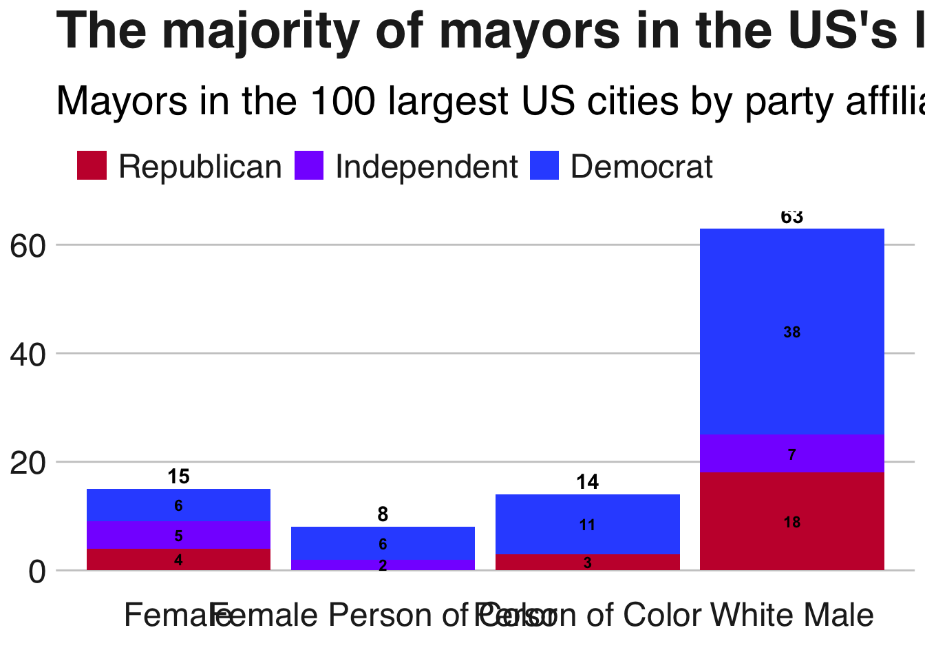
We now compare the breakdown of the ethnicity of cities governed by female mayors versus those controlled by mayors of color. Here we see that there is a clear difference in the percentage of people who identify as African-American. Cities governed by female mayors are on average less African-American than those governed by mayors who are people of color. When we run logistic regression, we will investigate if this is true when controlling for other mayoral and city characteristics.
plotdf = modeldf

plotdf = aggregate(cbind(perc_asian,perc_white,
                         perc_white_not_hispanic,perc_african_american,
                         perc_native_american,perc_pacific_islander,
                         perc_two_or_more
) ~ mayor_gender_f_1 + mayor_race_nonwhite_1, data = plotdf, mean, na.rm = TRUE)

plotdf = plotdf[plotdf$mayor_gender_f_1==1|plotdf$mayor_race_nonwhite_1==1,]

plotdf$type = ifelse(plotdf$mayor_gender_f_1==1,"Female","Person of Color")

plotdf = melt(plotdf[,colnames(plotdf)[!(colnames(plotdf) %in% c("mayor_gender_f_1","mayor_race_nonwhite_1"))]],
              id=c("type"))

plotdf = plotdf[order(plotdf$value),]
plotdf$value = ifelse(plotdf$type=="Female",-plotdf$value,plotdf$value)

plotdf$variable = ifelse(plotdf$variable=="perc_white","White",
                  ifelse(plotdf$variable=="perc_white_not_hispanic","White Not Hispanic",
                  ifelse(plotdf$variable=="perc_african_american","African American",
                  ifelse(plotdf$variable=="perc_asian","Asian",
                  ifelse(plotdf$variable=="perc_two_or_more","Two or More Races",
                  ifelse(plotdf$variable=="perc_native_american","Native American","Pacific Islander"))))))

brks = seq(-1, 1, .5)
lbls = paste0(as.character(c(seq(100, 0, -50), seq(50, 100, 50))), "%")

ggplot(plotdf, aes(x = reorder(variable, abs(value)), y = value, fill = type)) +
  geom_bar(stat = "identity", width = .6) +
  scale_y_continuous(breaks = brks,
                     labels = lbls) +
  geom_text(aes(x=variable, y=value,
                label=ifelse(variable%in%c("Native American","Pacific Islander"),"",paste(round(value*100,4),"%",sep = "")),
                hjust=.5),
            fontface = "bold") +
  coord_flip() +
  labs(title="Big cities with female mayors are less African-American",
       subtitle="Ethnicity in 100 largest American cities (% of population)") +
  bbc_style() +
  theme(legend.position = "top",
        legend.justification = "left") +
scale_fill_brewer(palette = "Dark2") 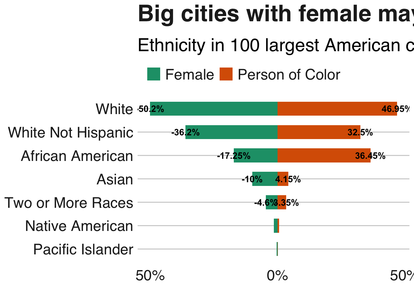
We also see that female mayors and mayors who are people of color control smaller cities. However, female mayors control larger than average budgets, while people of color control fiscal budgets that are smaller than the average across all 100 cities.
plotdf = as.data.frame(
  cbind(
    rbind("Person of Color","Female","Female Person of Color","White Male"),
    rbind(
      mean(modeldf$`2013_population`[modeldf$mayor_race_nonwhite_1==1]),
      mean(modeldf$`2013_population`[modeldf$mayor_gender_f_1==1]),
      mean(modeldf$`2013_population`[modeldf$mayor_race_nonwhite_1==1&modeldf$mayor_gender_f_1==1]),
      mean(modeldf$`2013_population`[modeldf$mayor_race_nonwhite_1!=1&modeldf$mayor_gender_f_1!=1])),
    rbind(
      mean(modeldf$budget[modeldf$mayor_race_nonwhite_1==1]),
      mean(modeldf$budget[modeldf$mayor_gender_f_1==1]),
      mean(modeldf$budget[modeldf$mayor_race_nonwhite_1==1&modeldf$mayor_gender_f_1==1]),
      mean(modeldf$budget[modeldf$mayor_race_nonwhite_1!=1&modeldf$mayor_gender_f_1!=1]))
  )
)

colnames(plotdf) = c("type","population","budget")
plotdf$population = as.numeric(as.character(plotdf$population))
plotdf$budget = as.numeric(as.character(plotdf$budget))
plotdf$average_budget = mean(modeldf$budget)
plotdf$diff_budget = (plotdf$budget-plotdf$average_budget)/plotdf$average_budget
plotdf$type_budget = ifelse(plotdf$diff_budget<0,"Below Average", "Above Average")
plotdf$average_population = mean(modeldf$`2013_population`)
plotdf$diff_population = (plotdf$population-plotdf$average_population)/plotdf$average_population
plotdf$type_population = ifelse(plotdf$diff_population<0,"Below Average", "Above Average")

p1=ggplot(plotdf, aes(x=type, y=diff_budget, label=budget)) +
  geom_bar(stat='identity', aes(fill=type_budget), width=.5)  +
  scale_fill_manual(name="Mileage",
                    labels = c("Above Average", "Below Average"),
                    values = c("Above Average"="#339A00", "Below Average"="#CD5C5C")) +
  scale_y_continuous(labels = scales::percent_format()) +
  geom_text(data = plotdf,
            aes(x=type, y=diff_budget, label=paste(paste("$",round(budget/1000000000,2),sep = ""),"Billion")),
            size = 3, position = position_stack(vjust = 0.5),fontface = "bold") +
  labs(
    title = "Fiscal Budget",
    x = "Degree Above/Below Average"
    # title= "Female mayors control larger budgets",
    # subtitle="Average size of latest fiscal year budget (billions of dollars)'"
    ) +
  bbc_style() +
  theme(legend.position = "top",
        legend.justification = "top",
        plot.title = element_text(hjust = 0.5),
        axis.text=element_text(size=10,face = "bold")) +
  coord_flip()

p2=ggplot(plotdf, aes(x=type, y=diff_population, label=population)) +
  geom_bar(stat='identity', aes(fill=type_population), width=.5)  +
  xlab("Degree Above/Below Average") +
  bbc_style() +
  scale_fill_manual(name="Mileage",
                    labels = c("Above Average", "Below Average"),
                    values = c("Above Average"="#339A00", "Below Average"="#CD5C5C")) +
  scale_y_continuous(labels = scales::percent_format()) +
  geom_text(data = plotdf, aes(x=type, y=diff_population, label=paste(round(population/1000,2),"Million")),
            size = 3, position = position_stack(vjust = 0.5), fontface = "bold") +
  labs(
    title = "2013 Population",
    x = "Degree Above/Below Average"
    # title="White men are mayors of larger US cities",
    #    subtitle= "Average 2013 population (millions)"
    ) +
  theme(legend.position = "top",
        legend.justification = "top",
        plot.title = element_text(hjust = 0.5),
        axis.text=element_text(size=10,face = "bold")) +
  coord_flip()

multiplot(p1, p2, cols=2)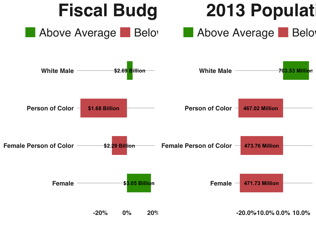
To investigate why these differences in population and the size of the recent fiscal budget exist, I plot individual cities on a graph where the population of the city is on the x-axis and the latest fiscal budget is on the y-axis. We see that there are a few notable outliers that may cause the differences in averages across the mayoral types. We see that Houston is a very populous city with a relatively small budget for its size, which may help drag down the average fiscal budget controlled by mayors of color. On the other hand, Phoenix appears to have an outsized fiscal budget for its population, which forces the average budget controlled by female mayors upward.
plotdf = modeldf
plotdf = plotdf[plotdf$mayor_gender_f_1==1|plotdf$mayor_race_nonwhite_1==1,]
plotdf$type = ifelse(plotdf$mayor_gender_f_1==1,"Female",ifelse(plotdf$mayor_race_nonwhite_1==1,"Person of Color","White Male"))

ggplot(plotdf, aes(x= `2013_population`, y= budget,
                     label=city_name,colour = factor(type))) +
  bbc_style() +
  geom_point() +
  geom_text(aes(label=city_name),hjust=0,vjust=0,
            check_overlap = TRUE) +
  scale_color_manual(values=c("#FAAB18", "#1380A1")) +
  labs(x = "Population", y = "Budget",colour = "Cluster",
       title="Phoenix and Houston are noticeable outliers",
       subtitle = "Population by Budget for 100 Largest Cities") +
  theme(legend.position = "top",
        legend.justification = "top",
        #plot.title = element_text(hjust = 0.5),
        axis.text=element_text(size=10,face = "bold"))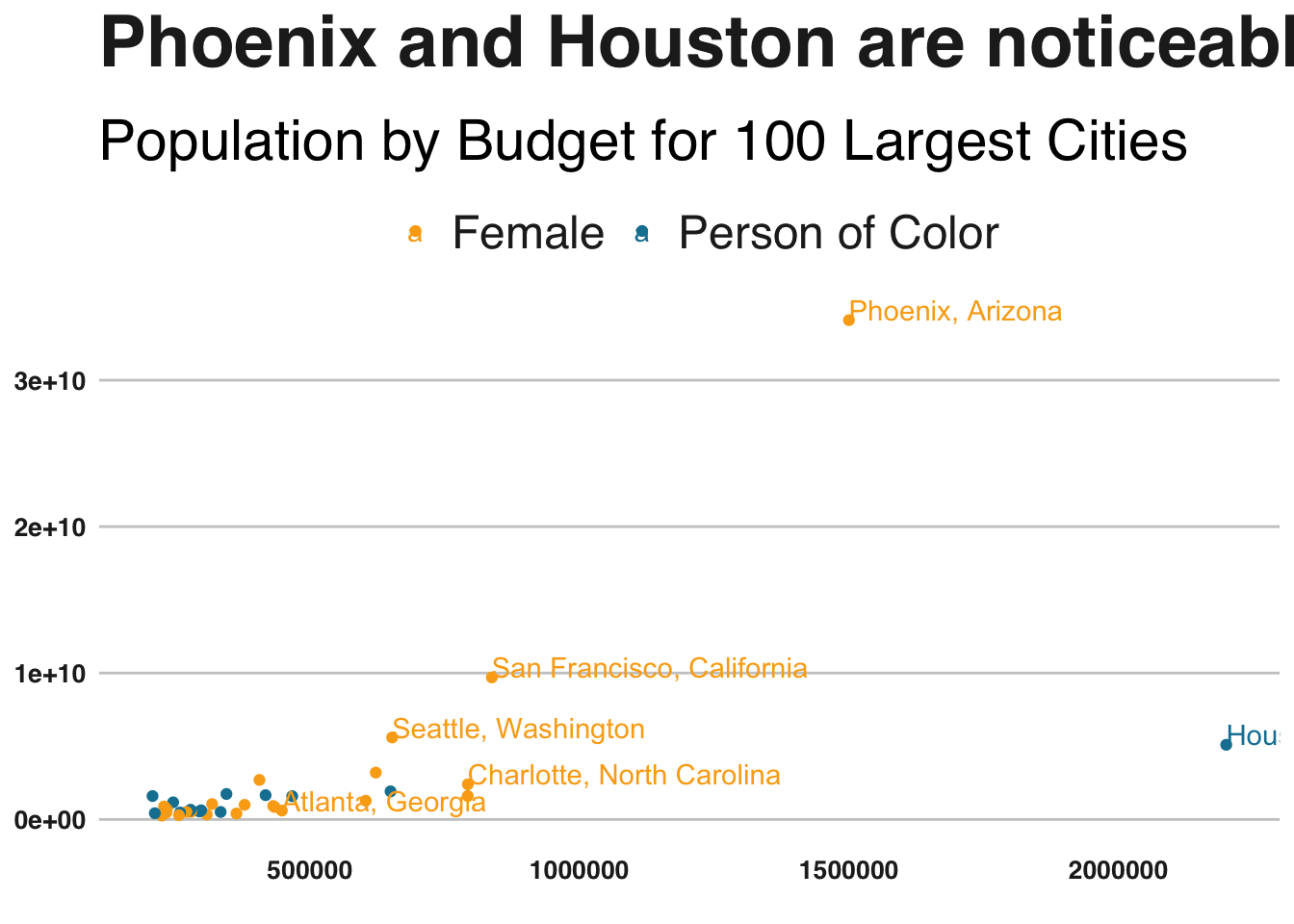
In the next three plots we investigate the distributions of different city characteristics using box plots. Below we see that the median income for cities controlled by female mayors is higher than those controlled by people of color. The two outliers for the female mayor group are Fremont, California and Gilbert, Arizona, both of which have median incomes above $80K. The outlier for the person of color group is Plano, Texas, which also has a median income above $80K. It’s worth noting that the mayor here is Henry LaRosiliere, the only Black Republican mayor in the dataset.
medians = aggregate(median_income ~ type, data = plotdf, median)
ggplot(plotdf, aes(type, median_income)) +
  bbc_style() +
  geom_boxplot(varwidth=T, fill="plum") +
  geom_text(data = medians,
            aes(x = type, y = median_income, label = paste0("$",median_income)),
            vjust=-.35) +
  labs(title="Female Mayors Govern Cities with Higher Incomes",
       subtitle="Distribution of Median Income by Mayor Type")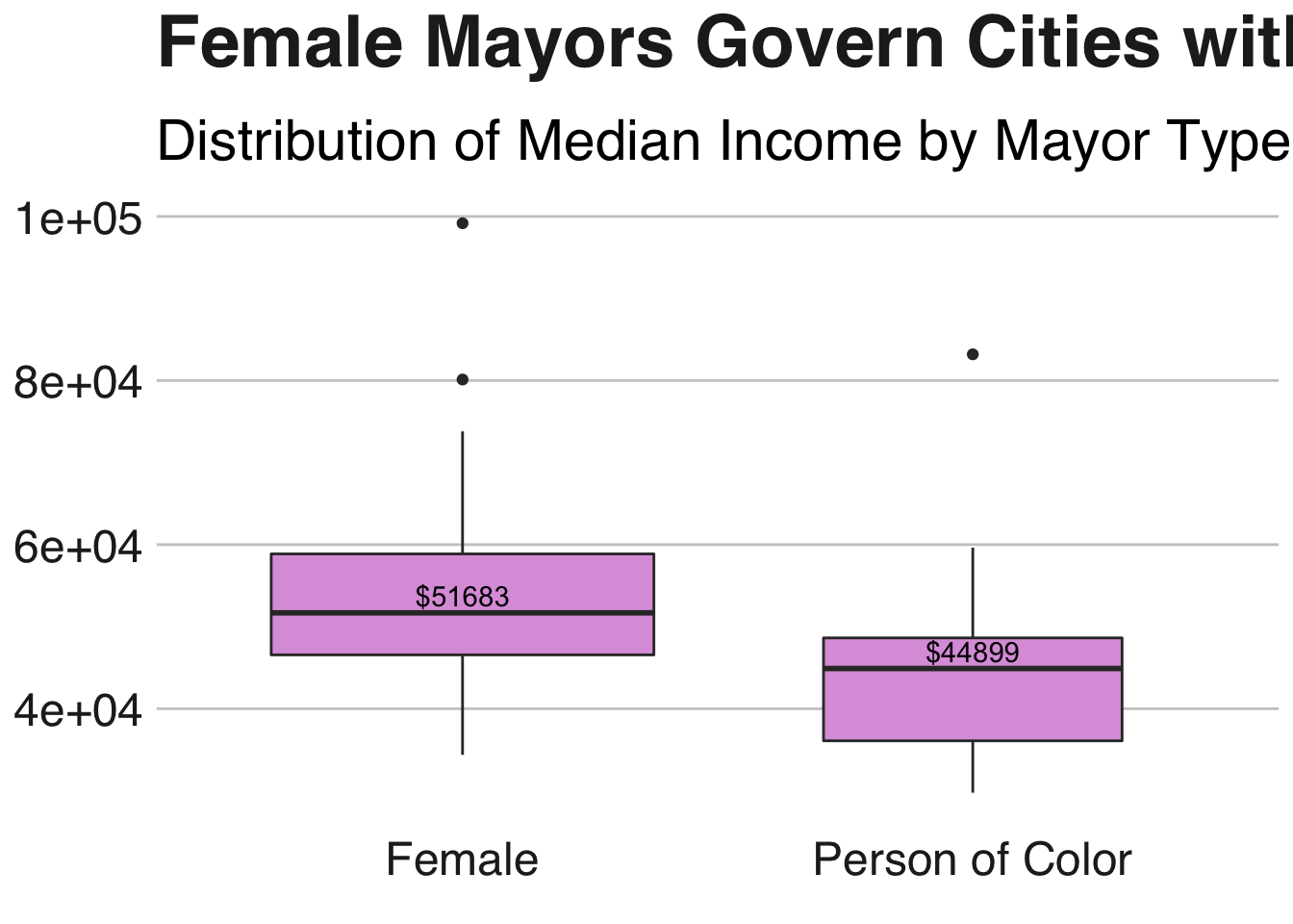
We also see that the college graduation rate is lower in cities governed by mayors who are people of color. The median college graduation rate for cities controlled by women is 32.7%, whereas it is 24.6% in cities controlled by mayors who are people of color.
medians = aggregate(college_grad_rate ~ type, data = plotdf, median)
ggplot(plotdf, aes(type, college_grad_rate)) +
  bbc_style() +
  geom_boxplot(varwidth=T, fill="#FAAB18") +
  geom_text(data = medians,
            aes(x = type, y = college_grad_rate, label = paste0(college_grad_rate*100,"%")),
            vjust=-.35) +
  labs(title="Mayors of Color Govern Cities with Lower College Grad Rates",
       subtitle="Distribution of College Grad Rates by Mayor Type")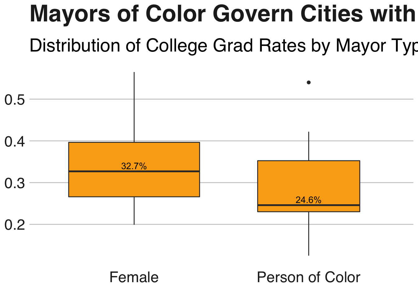
The plot belows creates a boxplot by mayor type for the unemployment rates across the cities in the dataset. We see that unemployment rates are roughly the same between mayoral types.
medians = aggregate(unemployment ~ type, data = plotdf, median)
ggplot(plotdf, aes(type, unemployment, label = unemployment),vjust=-.35) +
  bbc_style() +
  geom_boxplot(varwidth=T, fill="#1380A1") +
  geom_text(data = medians,
            aes(x = type, y = unemployment, label =  paste0(unemployment*100,"%")),
            vjust=-.35) +
  labs(title="Unemployment Rates are Similar Across Mayoral Types",
       subtitle="Distribution of Unemployment Rates by Mayor Type")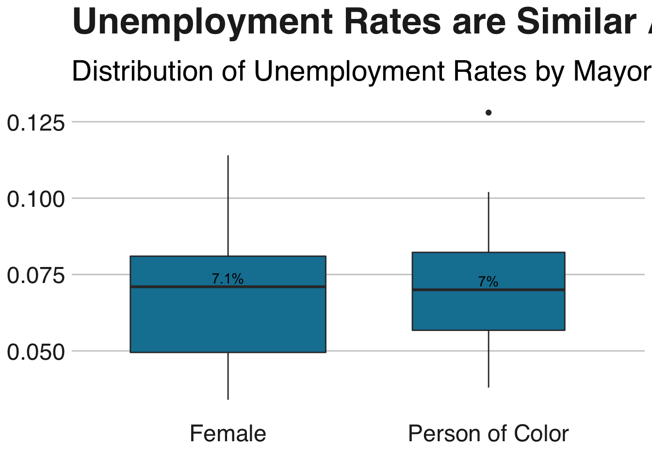
Model Building
The plots above are good for understanding the correlations of various city and mayoral features by mayoral type. However, to understand how all of these factors interact with each other and influence the outcome of female or person of color for each city’s mayor, we need to build a model. We will build separate regression models for these two outcomes. Logistic regression lends itself well to this use case because of its quick computation time, it’s applicability to small datasets, and it’s easy interpretability.
To aid further in interpretability, I build a function called generate_plot below. When we retrieve our covariate estimates, we will use the generate_plot function to hold all other factors used in the model constant, and only vary a specific variable. This will allow us to see how the probability of the outcome female or person_of_color changes when a single variable changes, holding the other model features constant.
generate_plot = function(chosen_var){

  vars = names(coef(summary(backwards))[,1])
  vars = vars[2:length(vars)]
  vars = gsub("`","",vars)

  vars_constant = vars[!(vars %in% chosen_var)]
  newdata = head(modeldf[,vars],10)

  for(i in 1:length(vars_constant)){
    newdata[,vars_constant[i]] = rep(mean(modeldf[,vars_constant[i]]),10)
  }

  newdata[,chosen_var] = seq(min(modeldf[,chosen_var]),max(modeldf[,chosen_var]),length.out = 10)

  newdata$pred = predict(backwards,newdata = newdata,type = "response")
  newdata$pred_diff = c(0,diff(newdata$pred,lag = 1))
  print(paste("Mean increase/decrease in probability for variable",chosen_var,":",mean(newdata$pred_diff)))

  return(
    ggplot(newdata, aes(x = newdata[,chosen_var], y = pred)) +
      geom_point() +
      labs(x = chosen_var, y = "estimated_probability")
  )
}
Female Mayor
Below we initialize a model equation with all of the variables we think may impact our mayor_gender_f_1 dependent variable. Using the glm function, we create a logistic regression model object, and then use the step function to perform backwards selection.
In the past, I found backwards selection to be a quick but rigorous way to find a parsimonious model for regression methods. Backwards selection is known as a wrapper method for reducing the number of predictors in a model. Wrapper methods evaluate multiple models using approaches that add or remove predictors to find combinations of features that optimize model performance. In backward selection, the initial model contains all predictors (see the model_equation specification below) which are iteratively removed to determine which do not have a significant contribution to the model’s performance.
The below step function uses the AIC statistic to evaluate model performance. The AIC statistic is essentially a penalized version of the tradition sum of squares error metric, and is useful in our case because it applies a penalty for the number of terms in the model, thereby ensuring a simpler model. The function below will print out each stage of the variable paring-down process, and will create an object we call backwards which will have the final pared-down model object.
model_vars = c("median_income","perc_african_american","perc_white","unemployment","2013_population",
               "budget","hs_grad_rate","college_grad_rate","mayor_gender_f_1","mayor_race_nonwhite_1")

model_equation = as.formula(paste("mayor_gender_f_1~perc_african_american+`2013_population`+hs_grad_rate+median_income+budget+college_grad_rate"))

logistic_model = glm(model_equation,
                     family = binomial(link = "logit") ,
                     data = modeldf[,model_vars])

#backwards selection is the default in this function
backwards = step(logistic_model)
## Start: AIC=106.95
## mayor_gender_f_1 ~ perc_african_american + `2013_population` +
## hs_grad_rate + median_income + budget + college_grad_rate
##
## Df Deviance AIC
## - hs_grad_rate 1 93.221 105.22
## - college_grad_rate 1 93.436 105.44
## <none> 92.953 106.95
## - median_income 1 96.317 108.32
## - perc_african_american 1 97.800 109.80
## - budget 1 99.013 111.01
## - `2013_population` 1 99.990 111.99
##
## Step: AIC=105.22
## mayor_gender_f_1 ~ perc_african_american + `2013_population` +
## median_income + budget + college_grad_rate
##
## Df Deviance AIC
## - college_grad_rate 1 93.452 103.45
## <none> 93.221 105.22
## - median_income 1 96.386 106.39
## - perc_african_american 1 97.969 107.97
## - budget 1 99.300 109.30
## - `2013_population` 1 100.066 110.07
##
## Step: AIC=103.45
## mayor_gender_f_1 ~ perc_african_american + `2013_population` +
## median_income + budget
##
## Df Deviance AIC
## <none> 93.452 103.45
## - perc_african_american 1 98.669 106.67
## - budget 1 99.636 107.64
## - median_income 1 99.730 107.73
## - `2013_population` 1 100.403 108.40Below we print out the formula for the model that the backwards selection process chose that minimized the AIC statistic, as well as the final AIC metric.
print(formula(backwards))## mayor_gender_f_1 ~ perc_african_american + `2013_population` +
## median_income + budgetpaste("Model AIC:",summary(backwards)$aic)## [1] "Model AIC: 103.452257655713"We then print the variable coefficient estimates below. The final model contains four variables that minimize the AIC statistic. As the above plots suggested, as the fiscal budget and median income in a city increase, so does the likelihood that the mayor of a city is female. Similarly, as the city population increases, the likelihood that the mayor of a city is female decreases. Surprisingly, however, we find that when controlling for other factors in the model, as the percentage of a city that identifies itself as African-American increases, so does the likelihood that a mayor will be female. This is a different conclusion from the one we drew earlier when we looked at the average rates of people in cities that identify as African-American across mayor types.
summary(backwards)##
## Call:
## glm(formula = mayor_gender_f_1 ~ perc_african_american + `2013_population` +
## median_income + budget, family = binomial(link = "logit"),
## data = modeldf[, model_vars])
##
## Deviance Residuals:
## Min 1Q Median 3Q Max
## -1.3919 -0.7000 -0.5216 -0.1888 2.0798
##
## Coefficients:
## Estimate Std. Error z value Pr(>|z|)
## (Intercept) -4.236e+00 1.517e+00 -2.792 0.00524 **
## perc_african_american 3.820e+00 1.696e+00 2.253 0.02428 *
## `2013_population` -2.077e-06 1.111e-06 -1.869 0.06166 .
## median_income 5.433e-05 2.251e-05 2.413 0.01580 *
## budget 2.140e-10 1.223e-10 1.750 0.08006 .
## ---
## Signif. codes: 0 '***' 0.001 '**' 0.01 '*' 0.05 '.' 0.1 ' ' 1
##
## (Dispersion parameter for binomial family taken to be 1)
##
## Null deviance: 107.855 on 99 degrees of freedom
## Residual deviance: 93.452 on 95 degrees of freedom
## AIC: 103.45
##
## Number of Fisher Scoring iterations: 6The first of the three graphs below bears this out. Holding all else constant, a city’s percentage of people who identify as African-American is actually a significant predictor of the likelihood that a city’s mayor is female. I also print similar graphs for a city’s fiscal budget and population.
generate_plot("perc_african_american")## [1] "Mean increase/decrease in probability for variable perc_african_american : 0.0616976686424508"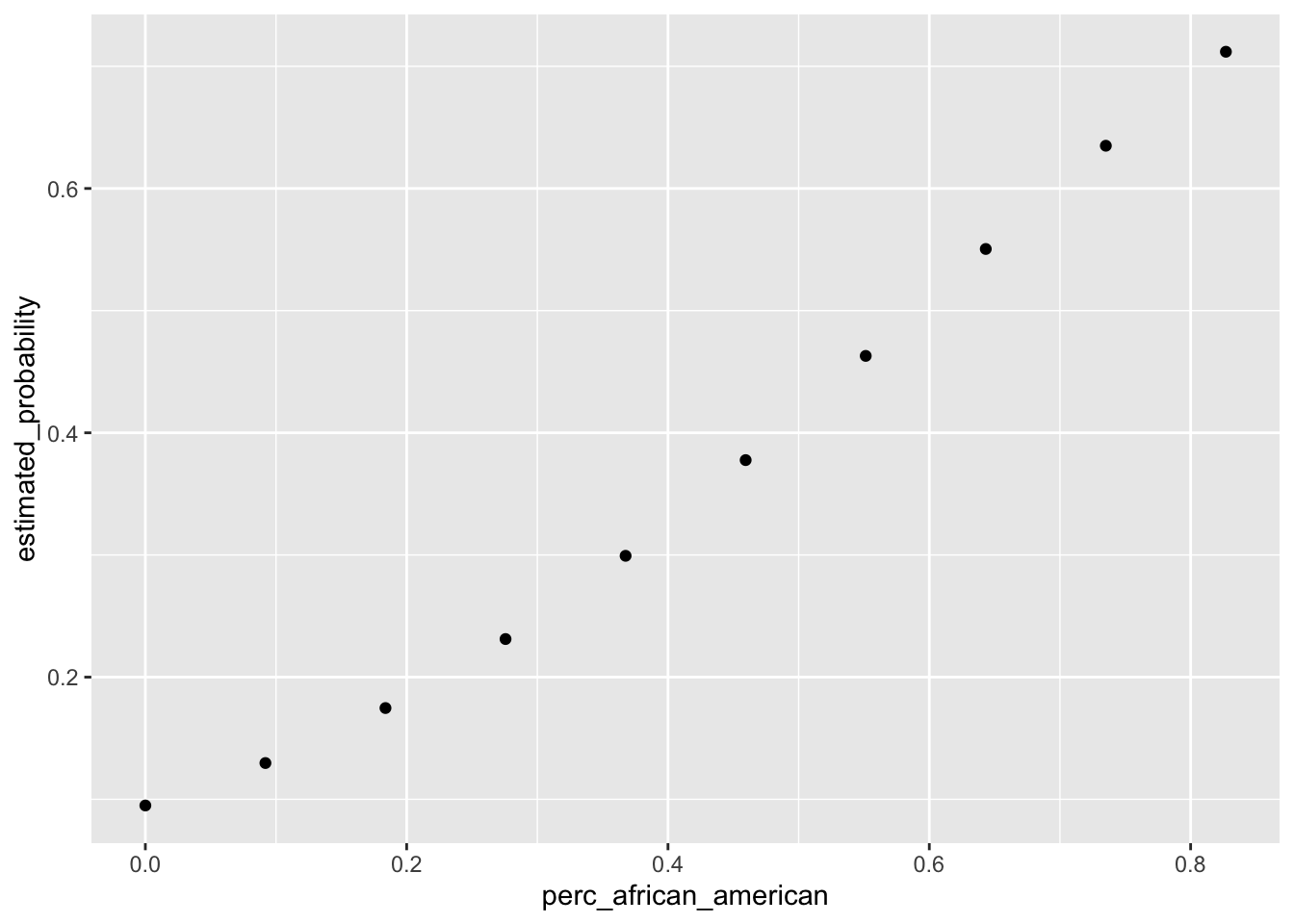
generate_plot("budget")## [1] "Mean increase/decrease in probability for variable budget : 0.0878881571300609"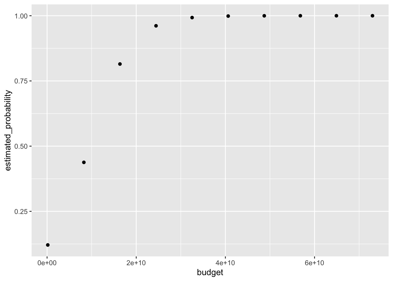
generate_plot("2013_population")## [1] "Mean increase/decrease in probability for variable 2013_population : -0.0351105066683875"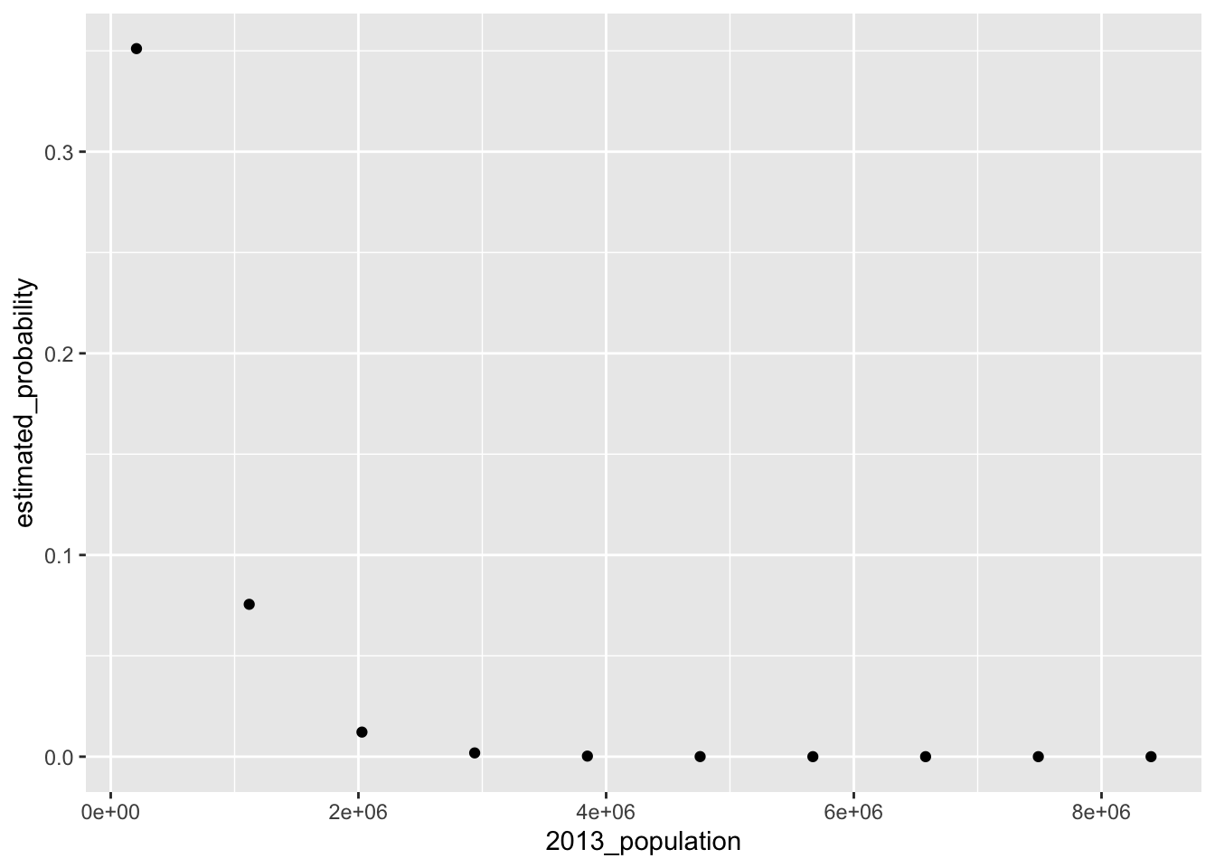
Mayor of Color
We perform the same backwards selection process for the model with mayor_race_nonwhite_1 as the target variable. Again, we initialize the model_equation with all variables, and pare down the model with the intent of creating a simpler model at the end of the process.
set.seed(88)

model_vars = c("median_income","perc_african_american","perc_white","unemployment","2013_population",
               "budget","hs_grad_rate","college_grad_rate","mayor_gender_f_1","mayor_race_nonwhite_1")

model_equation = as.formula(paste("mayor_race_nonwhite_1~perc_african_american+`2013_population`+hs_grad_rate+median_income+budget+college_grad_rate"))

logistic_model = glm(model_equation,
                     family = binomial(link = "logit") ,
                     data = modeldf[,model_vars])

backwards = step(logistic_model)
## Start: AIC=93.88
## mayor_race_nonwhite_1 ~ perc_african_american + `2013_population` +
## hs_grad_rate + median_income + budget + college_grad_rate
##
## Df Deviance AIC
## - budget 1 79.929 91.929
## - `2013_population` 1 81.803 93.803
## <none> 79.879 93.879
## - median_income 1 84.349 96.349
## - college_grad_rate 1 85.229 97.229
## - hs_grad_rate 1 93.699 105.699
## - perc_african_american 1 94.532 106.532
##
## Step: AIC=91.93
## mayor_race_nonwhite_1 ~ perc_african_american + `2013_population` +
## hs_grad_rate + median_income + college_grad_rate
##
## Df Deviance AIC
## <none> 79.929 91.929
## - `2013_population` 1 83.225 93.225
## - median_income 1 84.384 94.384
## - college_grad_rate 1 85.413 95.413
## - hs_grad_rate 1 93.811 103.811
## - perc_african_american 1 94.532 104.532We print the summary of the covariate estimates below, which includes the pared-down model specification as well as the final AIC statistic. Unsurprisingly, we see that the percentage of a city that identifies as African American is a strong indicator of the city’s mayor being a person of color. We also find that the high school graduation rate of a city is also an indicator of the city’s mayor being a person of color. Holding all else constant, as the high school graduation rate of a city decreases, the likelihood that a city’s mayor is a person of color increases.
summary(backwards)##
## Call:
## glm(formula = mayor_race_nonwhite_1 ~ perc_african_american +
## `2013_population` + hs_grad_rate + median_income + college_grad_rate,
## family = binomial(link = "logit"), data = modeldf[, model_vars])
##
## Deviance Residuals:
## Min 1Q Median 3Q Max
## -1.5027 -0.6299 -0.3315 -0.1534 2.1417
##
## Coefficients:
## Estimate Std. Error z value Pr(>|z|)
## (Intercept) 1.215e+01 4.893e+00 2.484 0.012995 *
## perc_african_american 6.937e+00 2.008e+00 3.454 0.000553 ***
## `2013_population` -9.452e-07 6.661e-07 -1.419 0.155891
## hs_grad_rate -2.523e+01 7.517e+00 -3.356 0.000790 ***
## median_income 6.533e-05 3.170e-05 2.061 0.039316 *
## college_grad_rate 9.875e+00 4.431e+00 2.229 0.025837 *
## ---
## Signif. codes: 0 '***' 0.001 '**' 0.01 '*' 0.05 '.' 0.1 ' ' 1
##
## (Dispersion parameter for binomial family taken to be 1)
##
## Null deviance: 105.382 on 99 degrees of freedom
## Residual deviance: 79.929 on 94 degrees of freedom
## AIC: 91.929
##
## Number of Fisher Scoring iterations: 6We generate the plots below for perc_african_american and hs_grad_rate to see how these variables impact the predicted probability, holding all other variables at their average levels.
generate_plot("perc_african_american")## [1] "Mean increase/decrease in probability for variable perc_african_american : 0.0885319076493798"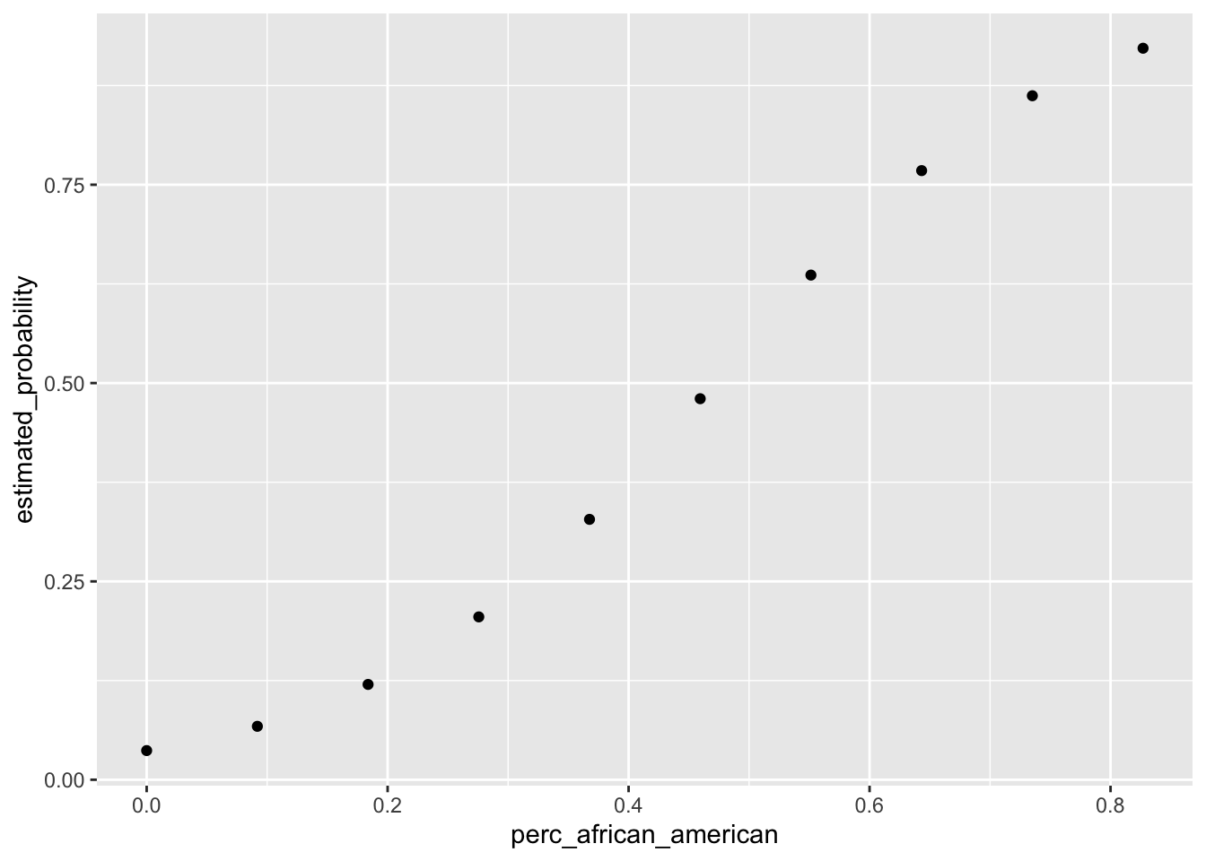
generate_plot("hs_grad_rate")## [1] "Mean increase/decrease in probability for variable hs_grad_rate : -0.0941203554262382"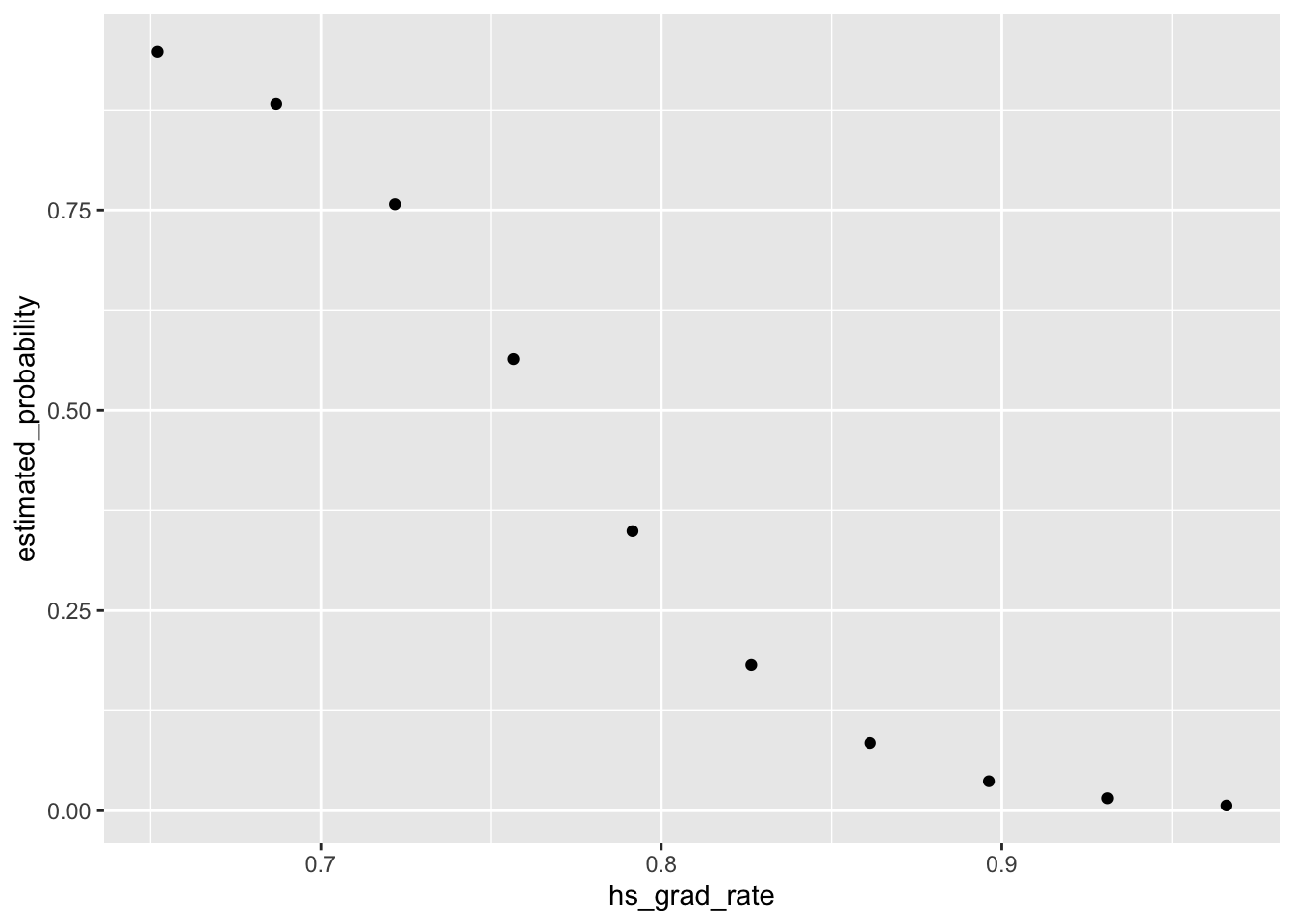
It is evident that there are differences between the cities and that these differences impact mayoral outcomes. However, we must keep in mind that the dataset we analyzed is small, and that a few mayoral outcomes could change the parameters of the models and the conclusions of our graphs above. To improve on this analysis, we could scrape together historical information on mayoral outcomes for these cities, and run the models on a larger dataset. We could also scrape more cities outside of the 100 largest ones, and thereby account for selection bias in our dataset. It could very well be the case that mayoral outcomes in the larger cities in the United States may differ dramatically from smaller cities, and that larger cities’s likelihood of electing a female or person of color differs from the rest of the United States’ likelihood of making these same electoral choices. Whatever the case, Chicago is set to make history, and other cities may follow suit in electing mayors of different ethnicities and genders. Once the Chicago mayoral election in April and other mayoral races in big cities conclude, the scraper and these models may need to be rerun to account for new changes in the United States’s political landscape.