Introduction/Processing the Data
Since I created this blog in May, I meant to write a time series-related post. I chose to piggyback off my latest post and analyze some time series data on United States vessel calls and capacity. Feel free to see that post for more information on the dataset.
I decided to keep this post relatively high-level, and focused on walking you through the most important time series concepts. I don’t go too in-depth in terms of the math behind many of the measures or models. I may do a more math-heavy post in the future. Instead, I chose to keep the code clean and simple so that it could be easily adapted to a different dataset.
For this analysis, I aggregated all of the data by year for the entire US. The time series object that I create includes, for each year between 2002 and 2015, the total number of vessels calls, the sum of all of these vessels’ capacity (in deadweight tonnage), and the average capacity per call.
Here is a quick table of contents for this post:
- A Look at the Time Series
- Simple Moving Average
- Simple Exponential Smoothing (Holt Winters)
- ARIMA Modeling
- Neural Network Time Series and Model Comparisons
Before diving into the analysis, however, I have to process the dataset.
First I define a multiplot function, which will allow me to create a number of plots all in the same frame.
multiplot = function(..., plotlist=NULL, file, cols=1, layout=NULL) {

  plots = c(list(...), plotlist)
  numPlots = length(plots)

  if (is.null(layout)) {
    layout = matrix(seq(1, cols * ceiling(numPlots/cols)),
                    ncol = cols, nrow = ceiling(numPlots/cols))
  }

  if (numPlots==1) {
    print(plots[[1]])

  } else {
    grid.newpage()
    pushViewport(viewport(layout = grid.layout(nrow(layout), ncol(layout))))
    for (i in 1:numPlots) {
      matchidx = as.data.frame(which(layout == i, arr.ind = TRUE))
      print(plots[[i]], vp = viewport(layout.pos.row = matchidx$row,
                                      layout.pos.col = matchidx$col))
    }
  }
}
Here, I read in the vessel information for each year across the 4 different spreadsheets. The first xls spreadsheet contains data from between 2002 and 2012, and the remaining 3 contain the data between 2013 and 2015.
set.seed(8)

library("readxl")
library("grid")
library("ggplot2")
library("TTR")
library("forecast")
library("lattice")

append_df = NULL
year = 2012
for(i in 2:12){

  df = read_excel("../../static/data/dsusportcalls2002-2012.xls", i)
  colnames(df) = df[3,]
  df = df[4:nrow(df),]
  df = df[,1:4]
  df$year = year

  append_df = rbind(append_df,df)
  year = year-1

}

append_df2 = NULL
year = 2013

for(i in 1:3){

  df = read_excel(paste("../../static/data/dsvesselcalls",as.character(year),".xlsx",sep = ""),1)
  colnames(df) = df[5,]
  df = df[6:nrow(df),]
  df = df[,1:4]
  df$year = year
  df$state = trimws(sapply(strsplit(df$Port,",",fixed = FALSE), "[", 2))
  df$Port = sapply(strsplit(df$Port,",",fixed = FALSE), "[", 1)

  append_df2 = rbind(append_df2,df)
  year = year+1

}

colnames(append_df) = c("port","state","calls","capacity_dwt","year")
append_df$capacity_gt = NA

colnames(append_df2) = c("port","calls","capacity_gt","capacity_dwt","year","state")
append_df2 = append_df2[,c("port","state","calls","capacity_dwt","year","capacity_gt")]

finaldf = rbind(append_df,append_df2)
Then, I aggregate the capacity and call information by year. The final dataset has four columns: the year, the total number of calls, the total sum of vessel capacity (in dwt), and the capacity per call.
df = finaldf[finaldf$port=="Grand Total",c("year","calls","capacity_dwt")]
df = df[!(rowSums(is.na(df))==ncol(df)),]

for(i in 2012:2002){
  df = rbind(df,
             c(i,
               sum(as.numeric(append_df$calls[append_df$year==as.character(i)]),na.rm = TRUE),
               sum(as.numeric(append_df$capacity_dwt[append_df$year==as.character(i)]),na.rm = TRUE)))
}

df = rbind(df,
           c(2012,
             sum(as.numeric(append_df$calls[append_df$year=="2012"])),
             sum(as.numeric(append_df$capacity_dwt[append_df$year=="2012"]))))

df$calls = as.numeric(df$calls)
df$capacity_dwt = as.numeric(df$capacity_dwt)
df$year = as.numeric(df$year)
df = df[order(df$year),]
df$capacity_call = df$capacity_dwt/df$calls
A Look at the Time Series
Below I coerce the dataframe that I created (which I called df) into a time series object. This is a useful object in R. Many of the R functions that I use below, which are essential for analyzing time series, require that the data you feed them is contained in a time series object. I then plot each time series:
tsData = ts(df[,c("calls","capacity_dwt","capacity_call")], start=c(2002), end=c(2015), frequency=1)

p1 = autoplot(tsData[,1]) +
  xlab("Year") +
  ylab("Calls") +
  ggtitle("Vessel Calls by Year") +
  theme(plot.title = element_text(hjust = 0.5))

p2 = autoplot(tsData[,2]) +
  xlab("Year") +
  ylab("Capacity") +
  ggtitle("Vessel Capacity by Year") +
  theme(plot.title = element_text(hjust = 0.5))

p3 = autoplot(tsData[,3]) +
  xlab("Year") +
  ylab("Capacity/Call") +
  ggtitle("Avg Capacity by Year") +
  theme(plot.title = element_text(hjust = 0.5))
multiplot(p1,p2,cols = 1)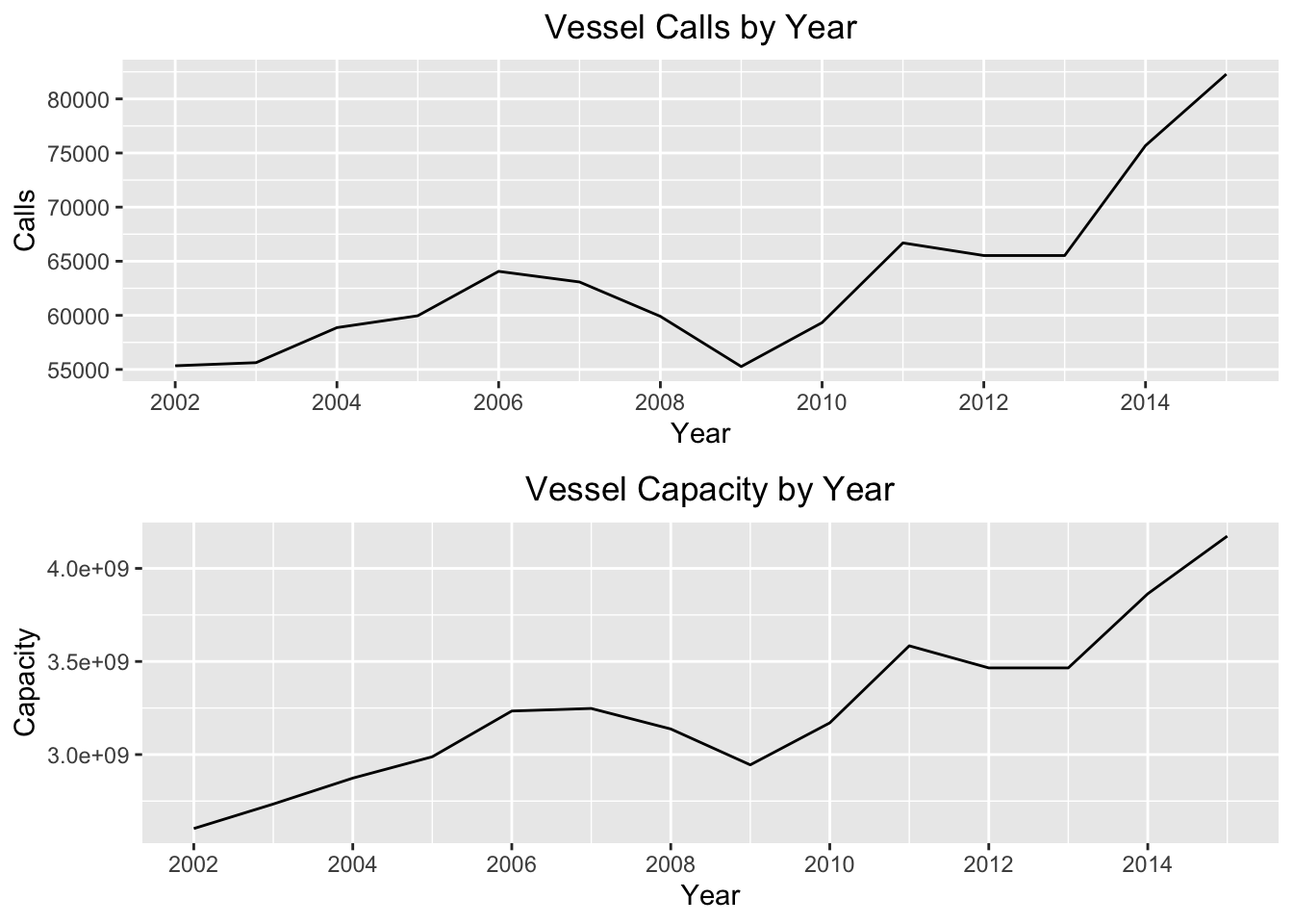
p3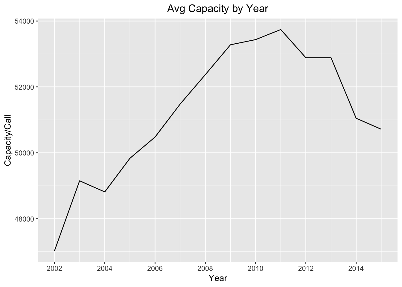
For the total calls and capacity, we can see that the series increases gradually over time, with a dip during the time of the financial collapse. If we look at the average vessel capacity per call, we see a gradual increase until about 2012 and then a decrease ending with a local minimum in 2015.
For each of these series, I use the acf and pacf R functions to plot the autocorrelation and the partial autocorrelation. This is a key step in analyzing time series data.
Autocorrelation is the correlation of the time series with itself. Why is this important? What these plots help us understand is whether or not previous values of our time series influence the current state of our time series. The “lags” at the bottom are previous states at x number of “lagged” observations. If the autocorrelation value is above the significancy level (i.e. above the blue dotted line), then that number lag is correlated with the current state of the time series.
Partial autocorrelation also helps us diagnose the relationship between the current state and previous states of the same series. It too shows the correlation of the time series with itself at different lags, but it removes the linear dependence between each of the lags.
These plots also help us figure out if a time series is stationary. What does this mean? In our case it means that a time series is constant in its mean and variance over time. We will find that this is important because stationary time series have useful properties that allow us to perform certain statistical and analytical techniques.
I plot the acf and pacf for vessel calls first:
p1 = autoplot(acf(tsData[,1],plot = FALSE)) +
  ggtitle("Series ACF for Vessel Calls") +
  theme(plot.title = element_text(hjust = 0.5))

p2 = autoplot(pacf(tsData[,1],plot = FALSE)) +
  ggtitle("Series PACF for Vessel Calls") +
  theme(plot.title = element_text(hjust = 0.5))

multiplot(p1,p2,cols=1)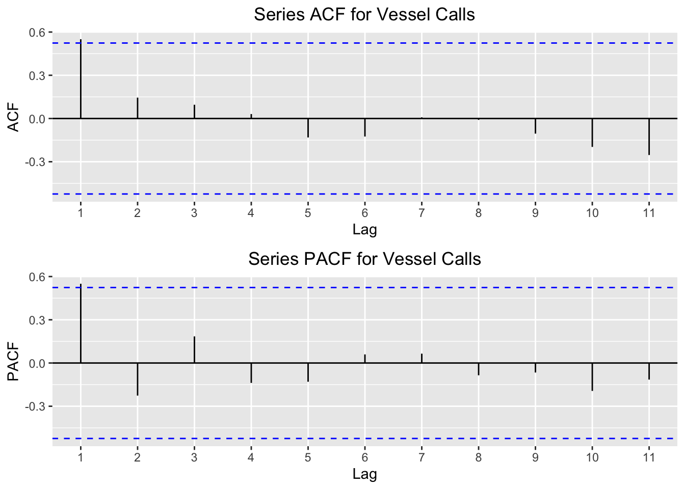
We can see here that the only significant lag is the first one. The interpretation is that the current value of the time series depends largely on the previous value of the series. When we build different models below, we will find other statistical evidence that this relationship exists.
I then plot the acf and pacf for vessel capacity:
p1 = autoplot(acf(tsData[,2],plot = FALSE)) +
  ggtitle("Series ACF for Vessel Capacity") +
  theme(plot.title = element_text(hjust = 0.5))
p2 = autoplot(pacf(tsData[,2],plot = FALSE)) +
  ggtitle("Series PACF for Vessel Capacity") +
  theme(plot.title = element_text(hjust = 0.5))

multiplot(p1,p2,cols=1)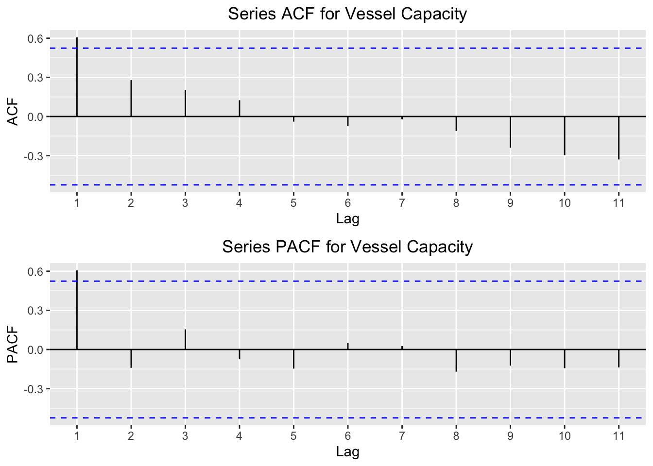
The same relationship here exists as it does for the vessel calls. Notice in the acf how for the first 4 lags there is a postive autocorrelation value, but the values after the 5th lag have a negative autocorrelation. This means that, as you go farther back in the series, the relationship with the current value actually becomes negative. This makes sense, given the first time series plots above. We saw that the summed calls and capacity were much higher in the latter years than in the earlier years, so it’s intuitive that these earlier years would be negatively correlated with the latter years.
Finally, I plot acf and pacf of the mean vessel capacity per call.
p1 = autoplot(acf(tsData[,3],plot = FALSE)) +
  ggtitle("Series ACF for Mean Vessel Capacity") +
  theme(plot.title = element_text(hjust = 0.5))
p2 = autoplot(pacf(tsData[,3],plot = FALSE)) +
  ggtitle("Series PACF Mean Vessel Capacity") +
  theme(plot.title = element_text(hjust = 0.5))

multiplot(p1,p2,cols=1)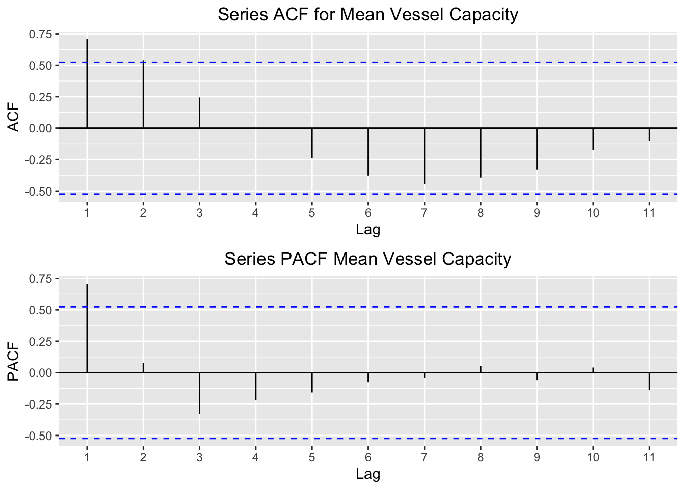
These plots tell us a slightly different story. As with the two previous series, the first few lags appear to influence the current value the most. However, we also see a certain wave-like pattern to the acf plot. This indicates that there is some cyclicity to this series. Taking a look at the plot over time for this series bears this out. At first the series increased, but then it dipped at around 2011. We can see this clearly by the distinct pattern in the autocorrelations over the lagged intervals in the acf plot.
Simple Moving Average
Most time series consist of three components. In mathematical form, a single point (\(Y_t\)) at time t can be written as the sum or product of these components (below I show the additive form):

where \(T_t\) is the trend, \(S_t\) is the seasonality, and \(ϵ_t\) is the noise or error term.
Since our time series is on a yearly basis, we do not have to worry about seasonality. If our time series were broken into monthly or weekly observations, then we’d have to consider this component.
For all time series analysis, the goal is to try to analyze each of these components separately. Our time series consists of a trend and noise term. To understand the trend of the time series, we can use a “smoothing” technique like a simple moving average (SMA) to isolate the series’ trend. This is the unweighted mean of the previous n datapoints. It is often used in finance, for example when an n-day sample for the closing price of a particular stock is the average of the previous n days’ closing prices.
For the remaining analysis, we’ll fit the models using the yearly total capacity as the target series. In the code chunk below, I iterate over the SMA function for different values n (also called the order) and calculate the mean squared error (MSE) for each. The order of the series is the number of periods to average over. Since the series is only 14 periods long, I iterate over the orders 2 through 6. I then print the order with the lowest MSE, which is simply the \((actual value - the SMA value)^2\).
mse_df = NULL
for(n in 2:6){
  ts_sma = SMA(tsData[,2],n=n)
  mse = mean(((tsData[,2]-ts_sma)^2),na.rm = TRUE)
  mse_df = rbind(mse_df,data.frame(n,mse))
}

print(mse_df$n[mse_df$mse == min(mse_df$mse)])
## [1] 2The order n with the smallest MSE value is n=2. Now, we’ll create a new object called ts_sma and save it with the n=2 argument. Let’s compare what the simple moving average does to the original series by comparing the two plots:
ts_sma = SMA(tsData[,2],n=mse_df$n[mse_df$mse == min(mse_df$mse)])

p1 = autoplot(tsData[,2]) +
  xlab("Year") +
  ylab("Capacity") +
  ggtitle("Vessel Capacity by Year") +
  theme(plot.title = element_text(hjust = 0.5))
p2 = autoplot(ts_sma) +
  xlab("Year") +
  ylab("Capacity") +
  ggtitle("Simple Moving Average") +
  theme(plot.title = element_text(hjust = 0.5))

multiplot(p1,p2,cols=1)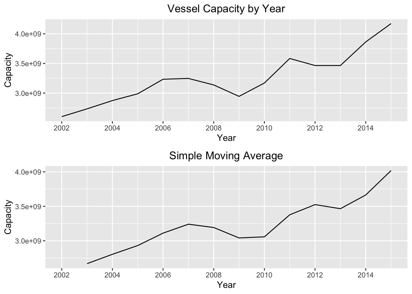
We can see that the simple moving average creates a much smoother time plot compared to the original series. However, simple moving averages are best used to estimate the trend component of a series only if the random “noise” is constant over time. To make this “noise” constant, we can try “differencing” the series. Differencing a time series means calculating the differences between consecutive observations. The point of differencing a time series is to eliminate the random error or “noise” component of the series. We can see the plot of the differenced series below:
p1 = autoplot(diff(tsData[,2],1)) +
  xlab("Year") +
  ylab("Capacity") +
  ggtitle("Series Differenced Once") +
  theme(plot.title = element_text(hjust = 0.5))

p2 = autoplot(diff(tsData[,2],3)) +
  xlab("Year") +
  ylab("Capacity") +
  ggtitle("Series Differenced Three Times") +
  theme(plot.title = element_text(hjust = 0.5))

multiplot(p1,p2,cols=1)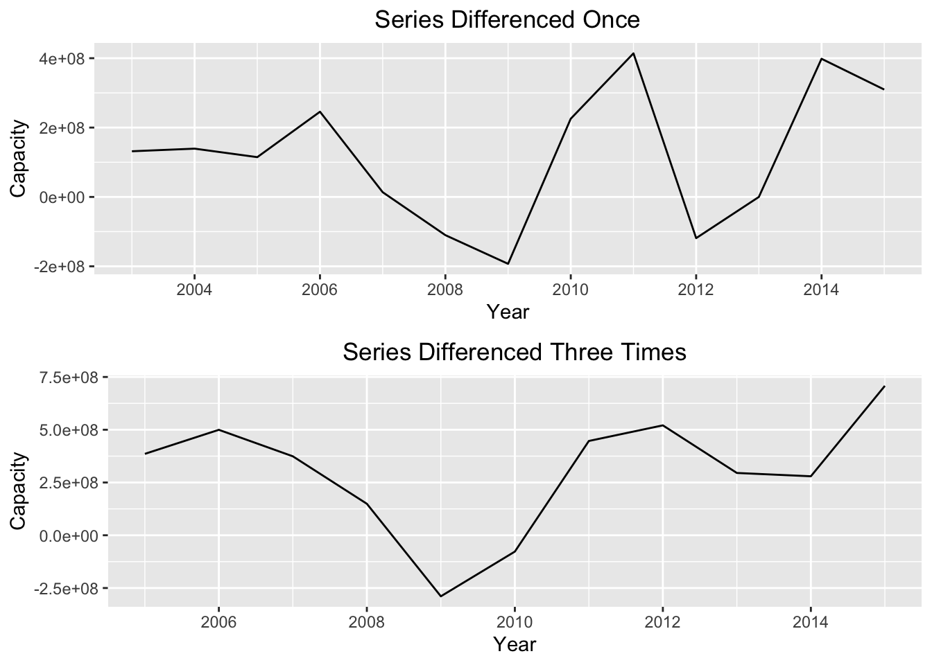
While differencing the series helps smooth out the noise, it does not completely make the series stationary in mean or variance. We will see that this will cause us problems when we try our next technique, Holt Winters exponential smoothing.
Simple Exponential Smoothing (Holt Winters)
Simple exponential smoothing (or the Holt Winters method) is another smoothing technique, but instead of taking the unweighted mean of the previous n datapoints it applies a smoothing constant to the previous period forecast. Mathematically it looks like this:

where \(F_t\) is the new forecasted period, \(F_{t-1}\) is the previous forecasted period, \(A_{t-1}\) is the actual value in the previous period, and \(\alpha\) is the smoothing constant.
I create a HoltWinters object and store it in ts_hw. I then print this object (which is actually a list) to see the calculated alpha parameter.
ts_hw = HoltWinters(tsData[,2],beta = FALSE,gamma = FALSE,l.start = tsData[1,2])
print(ts_hw)
## Holt-Winters exponential smoothing without trend and without seasonal component.
##
## Call:
## HoltWinters(x = tsData[, 2], beta = FALSE, gamma = FALSE, l.start = tsData[1, 2])
##
## Smoothing parameters:
## alpha: 0.9999401
## beta : FALSE
## gamma: FALSE
##
## Coefficients:
## [,1]
## a 4173273761The alpha parameter is very high…it’s nearly 1! What’s misleading in the term “smoothing parameter” is that high values of \(\alpha\) actually smooth the series less. So, if we insert the .99 alpha parameter into the above equation, we will see that the output of the series for \(F_t\) is essentially the previous value, \(F_{t-1}\).
To demonstrate, let’s take the HoltWinters object we created and forecast the series for 3 years into the future. The plot below plots the forecasted values as well as a 80% and 95% confidence interval:
forecast_hw = forecast:::forecast.HoltWinters(ts_hw, h=3)
autoplot(forecast_hw) +
  xlab("Year") +
  ylab("Capacity") +
  ggtitle("Holt Winters Forecasts") +
  theme(plot.title = element_text(hjust = 0.5)) +
  scale_x_continuous(breaks=seq(2002,2018))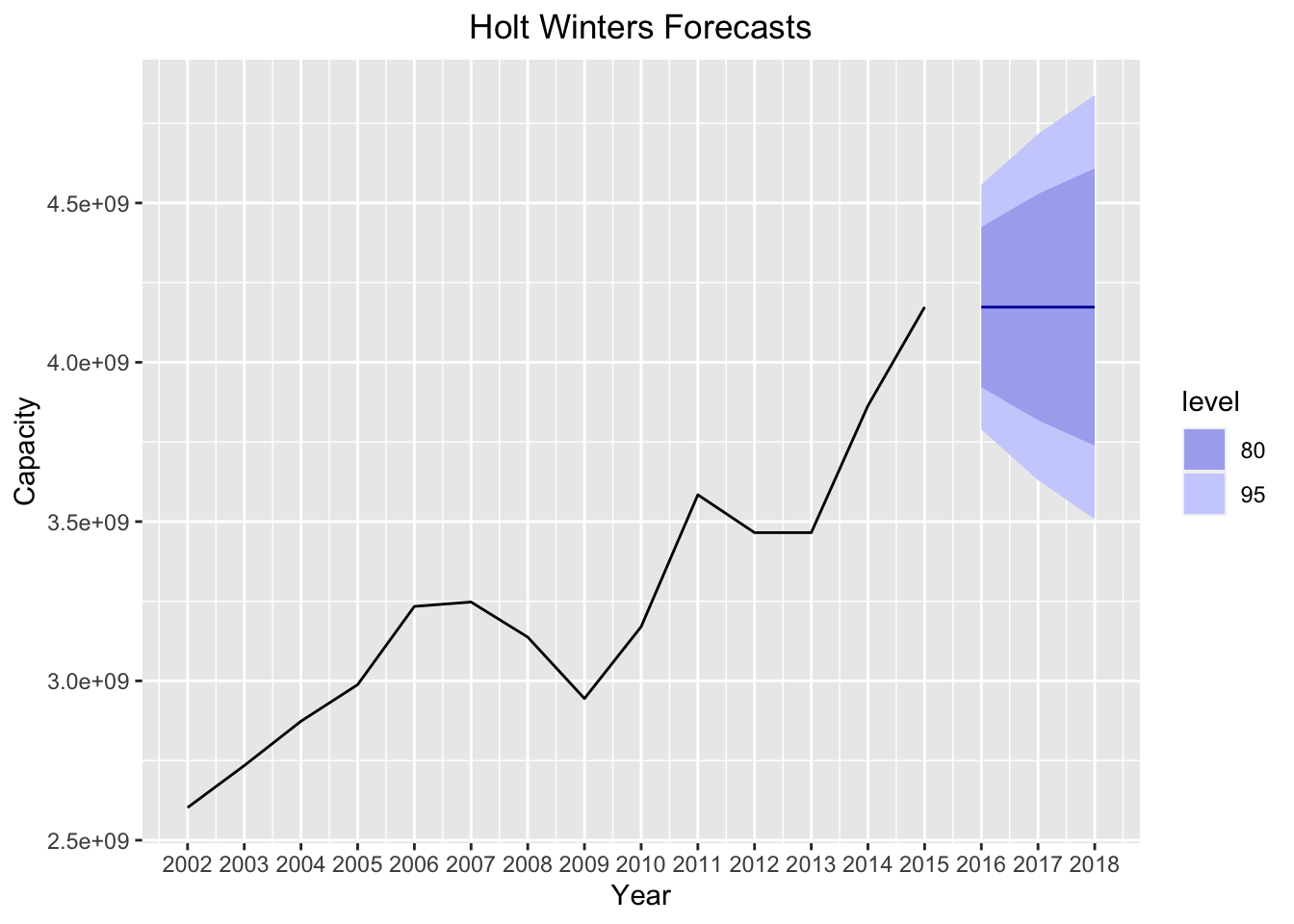
What do we see here? The forecasted levels are EXACTLY the same as the most recent 2015 observation! This makes sense, given that the smoothing parameter is nearly 1, because it makes the forecasted value exactly equal to the previous observation.
Let’s now plot some model diagnostics:
p1 = autoplot(acf(forecast_hw$residuals[!is.na(forecast_hw$residuals)], lag.max=10),
              plot = TRUE) +
  ggtitle("ACF Residuals") +
  theme(plot.title = element_text(hjust = 0.5))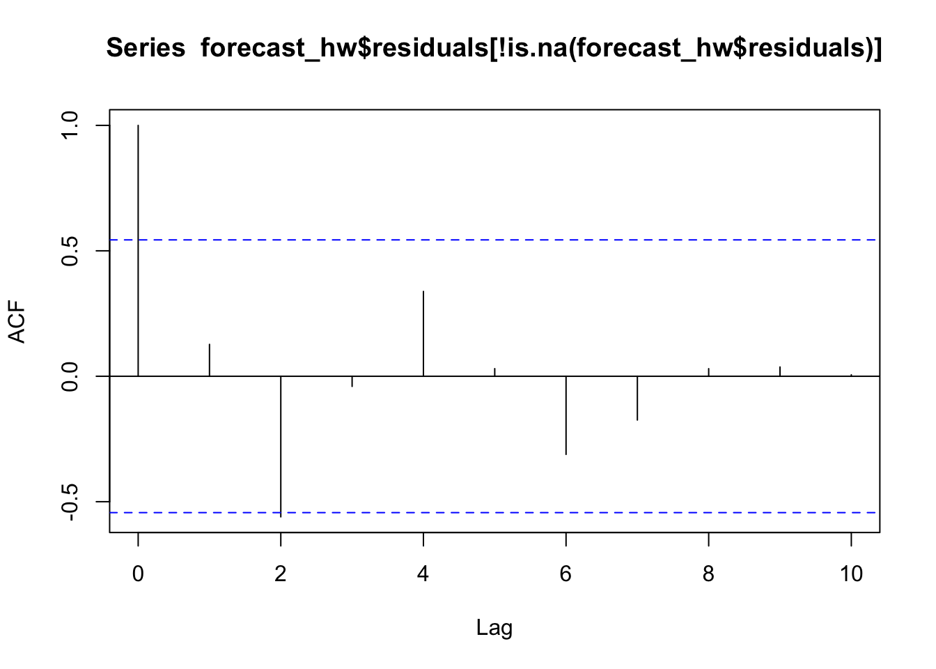
p2 = autoplot(ts(forecast_hw$residuals[!is.na(forecast_hw$residuals)])) +
  xlab("Year") +
  ylab("Residuals") +
  ggtitle("Forecast Residuals") +
  theme(plot.title = element_text(hjust = 0.5))
plotdf = as.data.frame(forecast_hw$residuals[!is.na(forecast_hw$residuals)])
colnames(plotdf)[1] = "residuals"
p3 = ggplot(data = plotdf,aes(residuals)) +
  geom_histogram(bins = 7) +
  xlab("Residual Bucket") +
  ylab("Frequency") +
  ggtitle("Forecast Residuals") +
  theme(plot.title = element_text(hjust = 0.5))

multiplot(p1,p2,p3,cols = 3)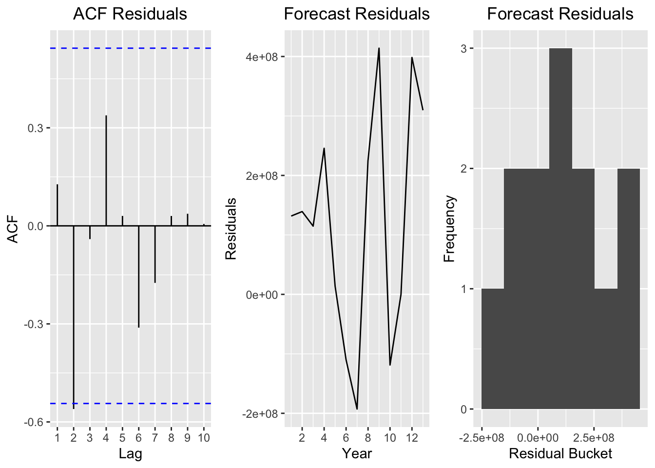
The first plot is a graph of the original total capacity time series but differenced once. The second graph is the residuals of the Holt Winters. A residual is simply the actual value minus the forecasted one. The third graph is a histogram of the residuals.
Ideally, we want to see a “well-behaved” series and residuals in these plots. A “well-behaved” series would be normally distributed and have constant variance. Looking at the differenced series and the residuals, however, we see a different picture. We see that the variance is by no means constant. Looking at the residual histogram, we also see that the residuals are not normally distributed.
The conclusion here is the Holt Winters is bad for this series. Why? Because Holt Winter is only defined for stationary series! Recall the above plots in the previous section when we differenced the series once and three times. Differencing the series did not completely make the series stationary in mean or variance. This makes this method a poor choice for our series, because if we look at the original series there is a very noticeable trend in the data.
ARIMA Modeling
ARIMA stands for autoregressive integrated moving average. We will see that ARIMA models have properties that make them much better suited to this time series.
For exponential smoothing methods like Holt Winters, the forecast errors must be uncorrelated, normally distributed and have constant variance. However, we may build a better model by taking into account the correlations in the series’ observations. ARIMA models incorporate an explicit statistical parameter to account for the irregular noise in a series. This component allows for autocorrelation that can exist in the “noisey” part of a time series.
Still, the actual series for ARIMA models must be stationary in the mean and have constant variance. This means that we need to difference the series until it is stationary.
An ARIMA model has several parameters. The first parameter in ARIMA models, i in the next code block, is the order of the model (or the number of time lags). The second is the differencing parameter d, which differences the series to make it stationary. The third parameter, j, is the order of the moving-average model. This is equivalent to the n parameter in the moving average model we built earlier.
In the code block below, I build a loop that 1) takes a differenced time series 2) extracts the AIC value and 3) stores the value in a matrix. The loop returns 4 matrices in total, one for each differenced series (between 0 differences and 3, the d parameter). The loop also iterates over all possible values between 1 and 10 of the i and j parameters needed in the arima function.
#create matrix to store AIC of ARIMA models
max.order = 10
AIC.matrix = list()

#set the maximum 'd' differences of the time series x to be 3
max.d = 3

#create a loop that fits all models and returns a new matrix for each integrated component 'd'
for(d in 0:max.d){
  AIC.temp.matrix = matrix(0,nrow = max.order+1,ncol= max.order+1)
  for(i in 1:(max.order+1)){
    for(j in 1:(max.order+1)){
      AIC.temp.matrix[i,j] = tryCatch(
        {
          currentArima = arima(tsData[,1],order=c(i-1,d,j-1))
          AIC(currentArima)
        },
        error=function(cond){
          errMessage = paste(i-1,d,j-1,sep=",")
          errMessage = paste0("Error in fitting ARIMA(",errMessage,"), setting AIC to 10^6")
          message(errMessage)
          return(10^6)
        },
        warning=function(cond){
          errMessage = paste(i-1,d,j-1,sep=",")
          errMessage = paste0("Error in fitting ARIMA(",errMessage,"), setting AIC to 10^6")
          message(errMessage)
          return(10^6)
        })
    }
  }
  AIC.matrix[[d+1]] = AIC.temp.matrix
}
The code below constructs a “level plot”" in which each square represents a value in the matrix. This plot helps us figure out which parameters produce better models (defined as the ones that produce a model with a lower AIC). I create a separate plot for each differenced series. In general we find that the models with lower i parameter values tend to perform better than those with high values for the i and j parameters.
plot.new()
par(mfrow=c(2,2), oma=c(2,0,2,0))
print(levelplot(AIC.matrix[[1]],main="0 Differenced"), split=c(1, 1, 2, 2))
print(levelplot(AIC.matrix[[2]],main="1 Differenced"), split=c(1, 2, 2, 2), newpage=FALSE)
print(levelplot(AIC.matrix[[3]],main="2 Differenced"), split=c(2, 1, 2, 2), newpage=FALSE)
print(levelplot(AIC.matrix[[4]],main="3 Differenced"), split=c(2, 2, 2, 2), newpage=FALSE)
title("Centered Overall Title", outer=TRUE)
mtext(side=1, "Centered Subtitle", outer=TRUE)
While the plot above helps us get a general sense of which parameters produce better models, we have to remember that the loop builds 400 different models with all the possible parameter combinations. We need to figure out which model is best by figuring out which parameters produce the model with the lowest AIC value.
Below we build a functon to find the minimum value for each differenced matrix. I print both the matrix index (which tells us the values of the i and j parameters) of the model with the lowest AIC, and the actual AIC value. Each matrix stores the AIC values for the four differenced series. I also create a function which takes a list of matrices and prints the parameters of the model with the lowest AIC.
findMin = function(matrix){
  matrixIndex = which(matrix == min(matrix), arr.ind = TRUE)
  minAIC = min(matrix)
  print(matrixIndex)
  print(minAIC)
}

findLowestAIC = function(matrixList){

  bestParameters = c(0,0,0)
  lowestAIC = 10^10

  for(i in 1:length(matrixList)){

    if(min(matrixList[[i]])<lowestAIC){

      lowestAIC = min(matrixList[[i]])
      matrixIndex = which(matrixList[[i]] == min(matrixList[[i]]), arr.ind = TRUE)
      bestParameters[1]=matrixIndex[1];bestParameters[2]=i;bestParameters[3]=matrixIndex[2];

    }
  }

  return(bestParameters)

}findMin(AIC.matrix[[1]])## row col
## [1,] 1 3
## [1] 280.7254findMin(AIC.matrix[[2]])## row col
## [1,] 1 2
## [1] 257.1014findMin(AIC.matrix[[3]])## row col
## [1,] 3 1
## [1] 239.9065findMin(AIC.matrix[[4]])## row col
## [1,] 3 2
## [1] 226.7495matrixList = list(AIC.matrix[[1]],AIC.matrix[[2]],AIC.matrix[[3]],AIC.matrix[[4]])
findLowestAIC(matrixList)## [1] 3 4 2The model with the lowest AIC has a time lag of 3 (i parameter), in which the series is differenced four times (d parameter), and has a moving average parameter of 2 (j parameter).
I then plot the acf and pacf of the residuals for this model.
model.params = findLowestAIC(matrixList)
best.model = arima(tsData[,2],order=c(model.params[1],model.params[2],model.params[3]))

p1 = autoplot(acf(best.model$resid,plot = FALSE)) +
  ggtitle("Best ARIMA Model Residuals ACF") +
  theme(plot.title = element_text(hjust = 0.5))
p2 = autoplot(pacf(best.model$resid,plot = FALSE)) +
  ggtitle("Best ARIMA Model Residuals PACF") +
  theme(plot.title = element_text(hjust = 0.5))

multiplot(p1,p2,cols=1)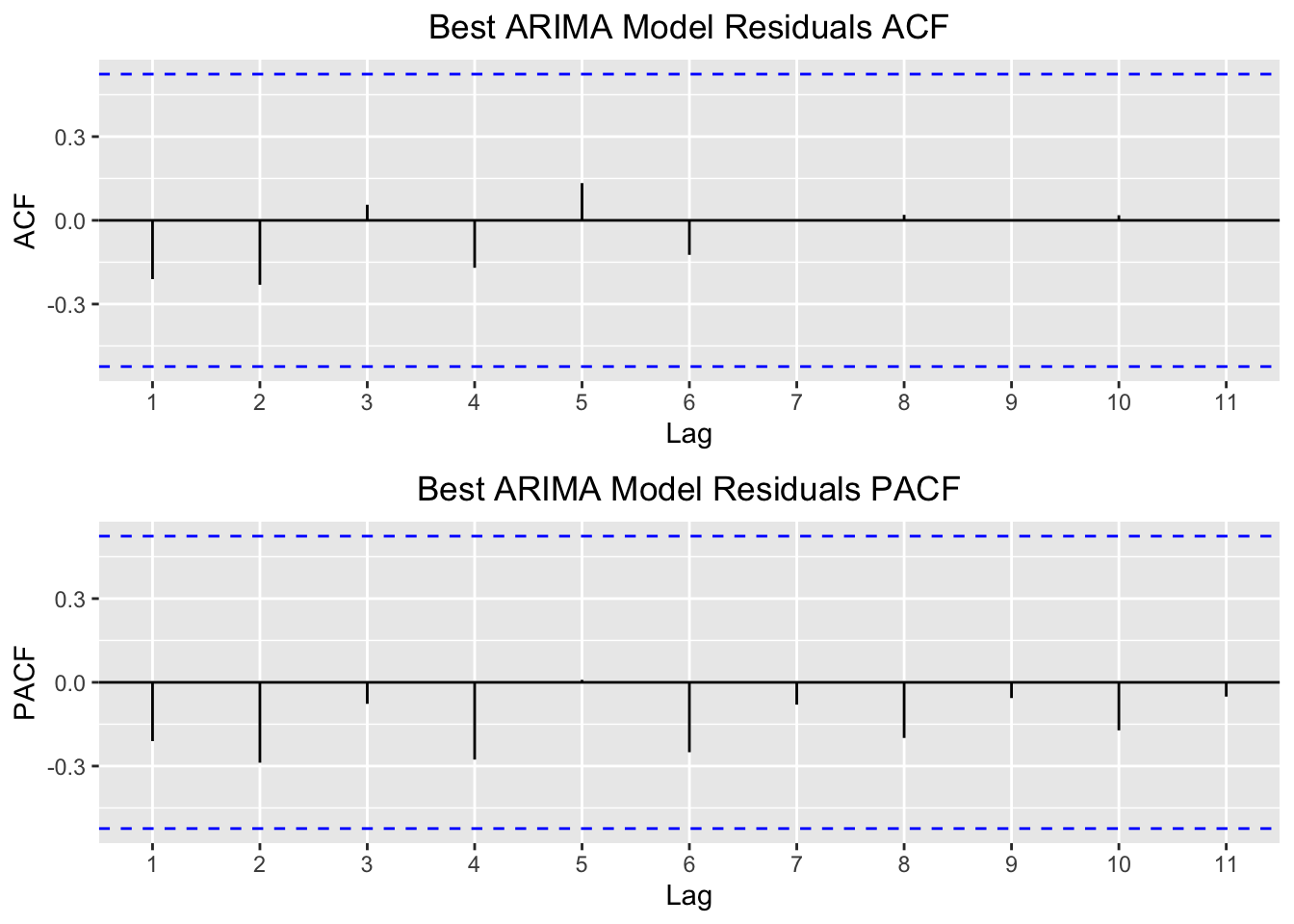
In contrast to the Holt Winters model, the ARIMA residuals show little correlation with each other. These plots suggest that the fit the ARIMA model creates is much better suited to this series. They also suggest that our forecasts should be much more accurate and reasonable.
Below I plot the ARIMA model forecast for 3 years into the future, including confidence levels of 80% and 95%.
forecast_arima = forecast(best.model, h=3)
autoplot(forecast_arima) +
  xlab("Year") +
  ylab("Capacity") +
  ggtitle("ARIMA Model Forecasts") +
  theme(plot.title = element_text(hjust = 0.5)) +
  scale_x_continuous(breaks=seq(2002,2018))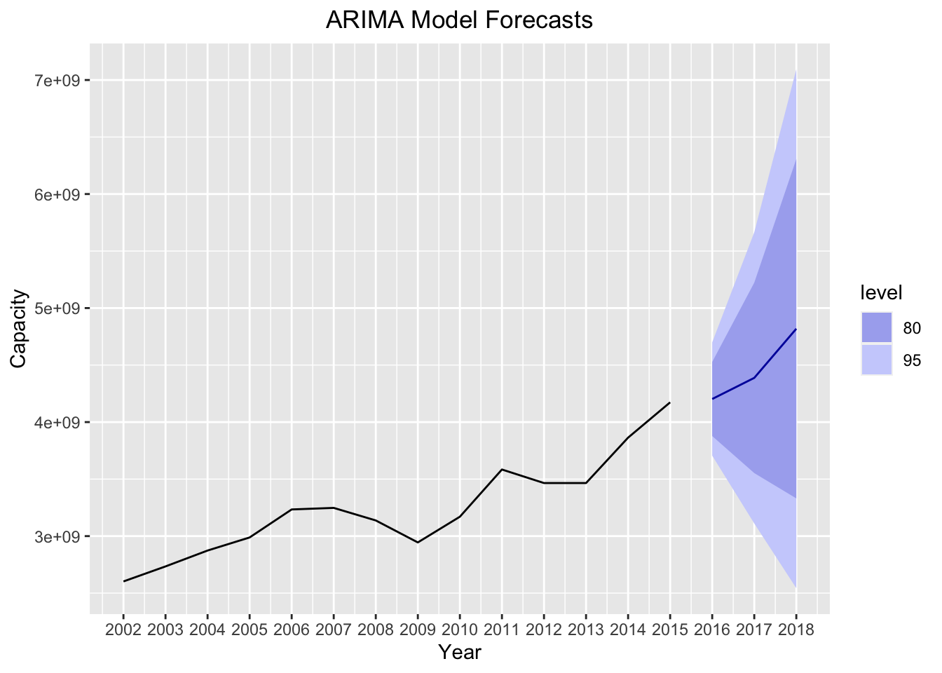
As we expect, the ARIMA model takes into account the trend of the series, and creates a reasonable forecast for our series. This is a significant improvement over the forecasts of our Holt Winters model, in which the forecasts were exactly equal to the previous observation for each forecasted year.
Neural Network Time Series and Model Comparisons
We’ll finish this post with just a taste of a more complicated time series model: the neural network time series. I plan to devote another post to more complex time series models, and in that post I’ll go further into how neural networks work and what goes on underneath the hood of the nnetar function. For now, I’ll defer to this pretty good explanation from the nnetar documention for how neural nets work.
Neural nets have interesting properties. One of the most useful features of neural networks is that they are able to suss out complicated, nonlinear relationships between the features and a response variable. For all intents and purposes, this model is not applicable to our problem. Neural nets are generally not applied to univariate (i.e. one variable) time series. They also are extremely data hungry, meaning that it makes many datapoints to train the model properly. Our series violates those two principles. Nonetheless, I was curious what the forecasts would look like for the model. We build the model below, and plot the forecast:
model.nn = nnetar(tsData[,2],p = 1)
forecast_nn = forecast(model.nn,h=3)
autoplot(forecast_nn) +
  xlab("Year") +
  ylab("Capacity") +
  ggtitle("Neural Net Forecasts") +
  theme(plot.title = element_text(hjust = 0.5)) +
  scale_x_continuous(breaks=seq(2002,2018))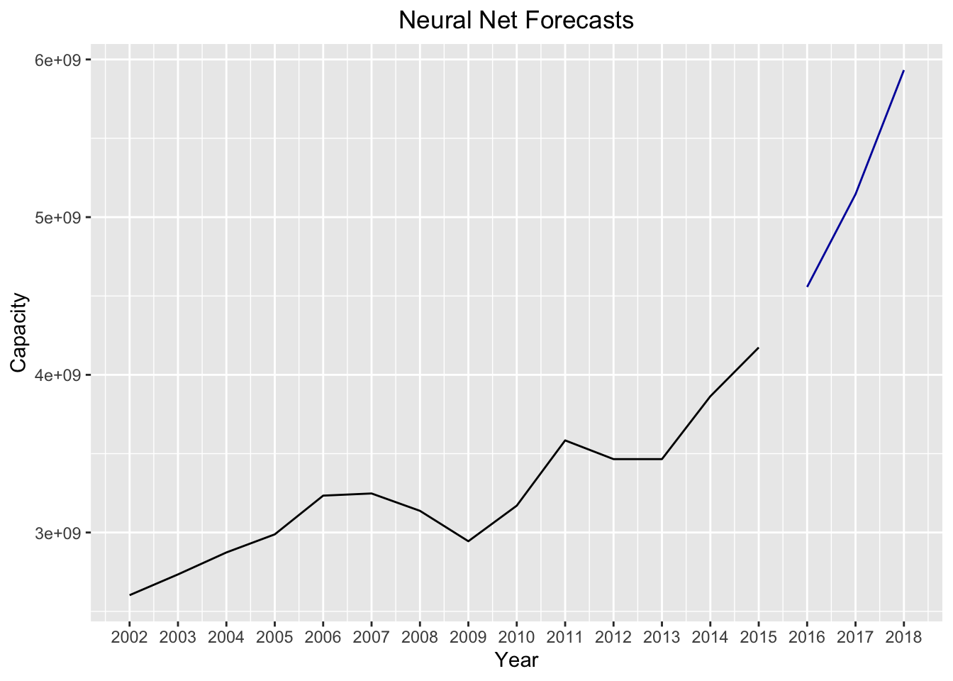
In comparison to the ARIMA model, the forecasts for the neural net look exponential while the ARIMA forecasts were much smoother. Again, we didn’t run the same diagnostics on the neural network model as we did for the other models we built (I’ll explain why neural net model diagnostics are more difficult in a different post). However, we can still assess the relative fits between the ARIMA and the neural net models by comparing the MSEs between the two:
paste("The MSE is lowest for the",
      ifelse(mean(((best.model$residuals)^2),na.rm = TRUE)<mean(((model.nn$residuals)^2),na.rm = TRUE),
      "ARIMA","Neural Net"),"model",sep = " ")
## [1] "The MSE is lowest for the Neural Net model"Surprisingly, the neural network model provides the better fit according to the mean squared error.
As I mentioned in the beginning of this post, most of this code can be applied to other series with only slight alterations. It would be interesting to see how these forecasts perform with the other series in this time series object (the vessel calls and the average capacity per call). I’m also curious how these forecasts will compare to the actual total capacity figures for 2016, 2017, and 2018 (release the data, MARAD!). Once those figures are released, I may write a follow up post to see how well these forecasts performed.